Compare
Set your institution against the peers you choose.
The same published measure, over time, for you and each peer. The CHESS Ranking reads 37 universities on ten dimensions.
The Executive Edition
Bring market intelligence, institutional benchmarking and scenario modelling into the same platform. Explore the evidence behind a policy, investment or strategic choice, then prepare the analysis for your team to review.
For universities, research organisations, government and education partners.
On application. An institutional licence, agreed with CoreBridge Intelligence.
How the licence worksThe film
Narrated by Rosie, made from the platform’s own screens.
Compare
The same published measure, over time, for you and each peer. The CHESS Ranking reads 37 universities on ten dimensions.
Investigate
Courses and admissions, 81 source markets, jobs and skills by region, and the Intergenerational Report 2026, read for tertiary education.
Model
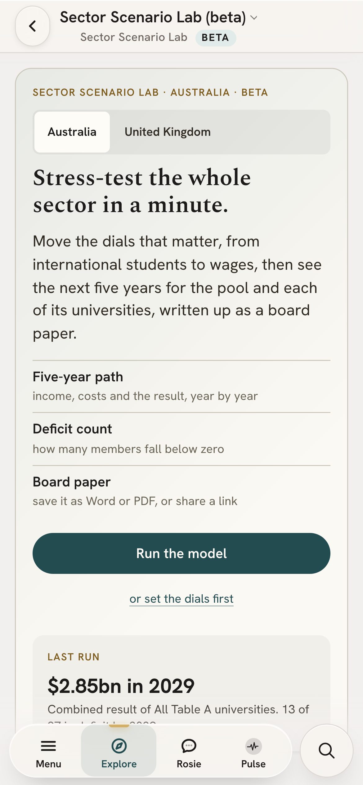
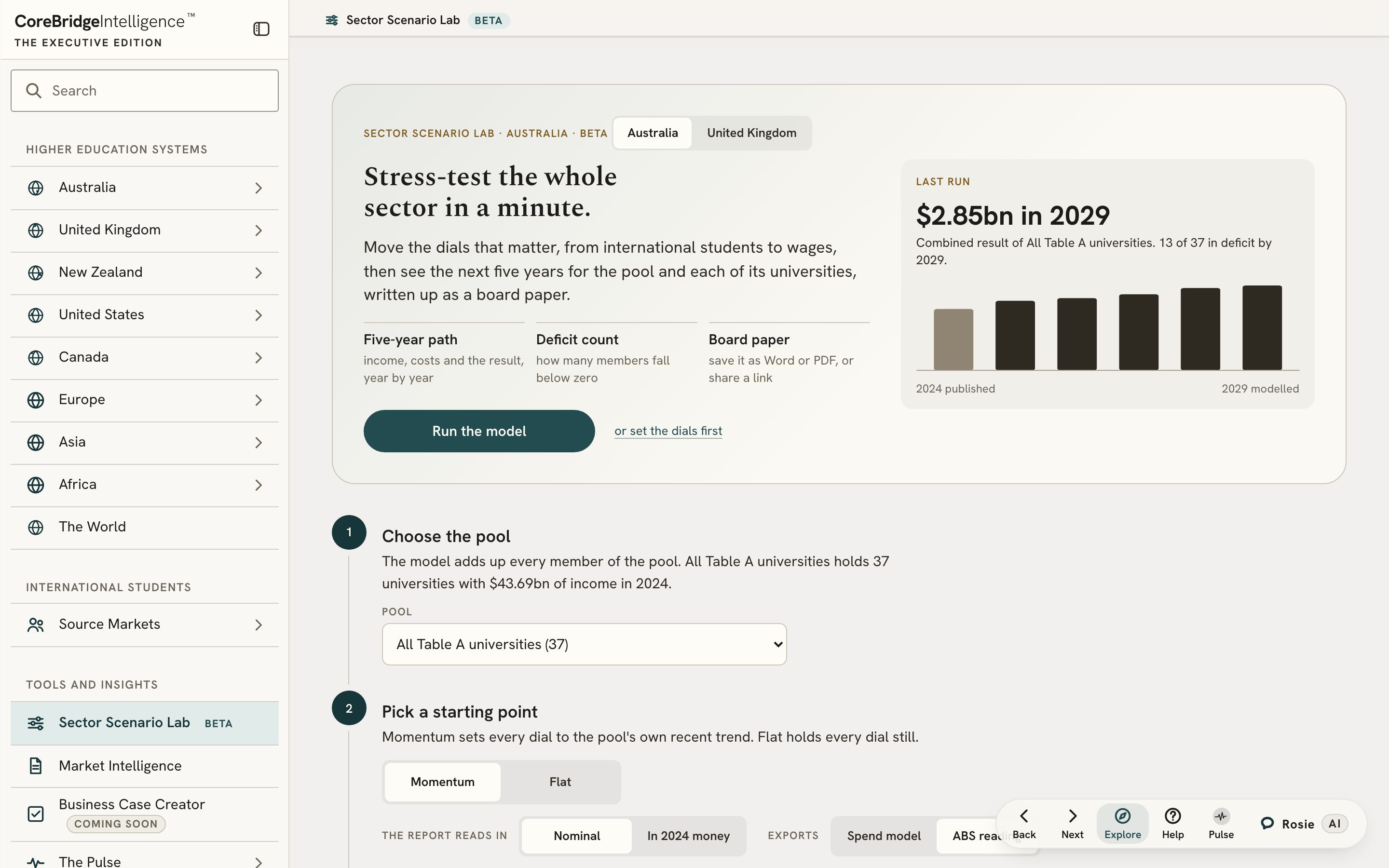
The Sector Scenario Lab (beta) applies an assumption you set, such as fewer international students, to each university’s published accounts and shows the result year by year. It illustrates the assumption; it is not a forecast.
Prepare
A board paper that opens in Word (beta), or a Market Intelligence deck in PowerPoint. Each figure carries its source and year.
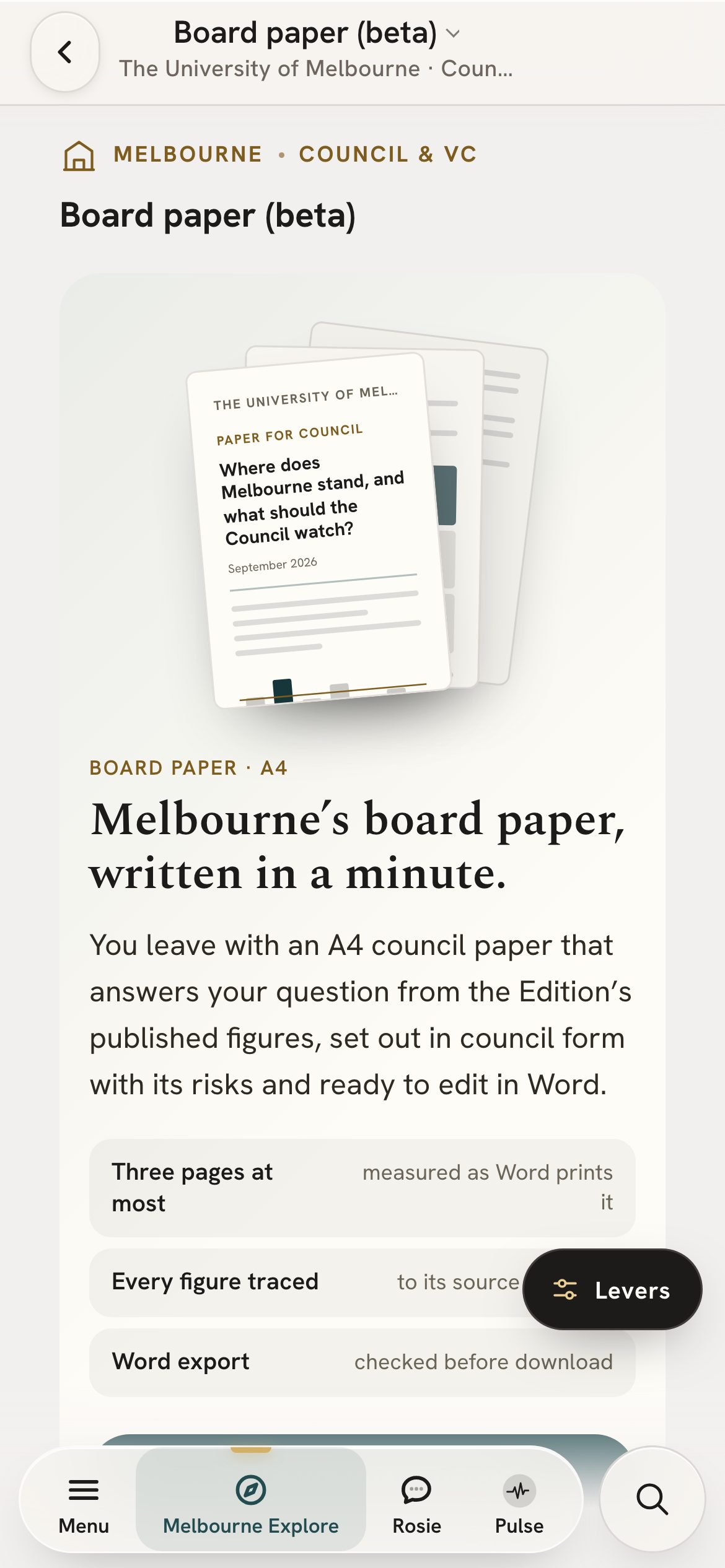
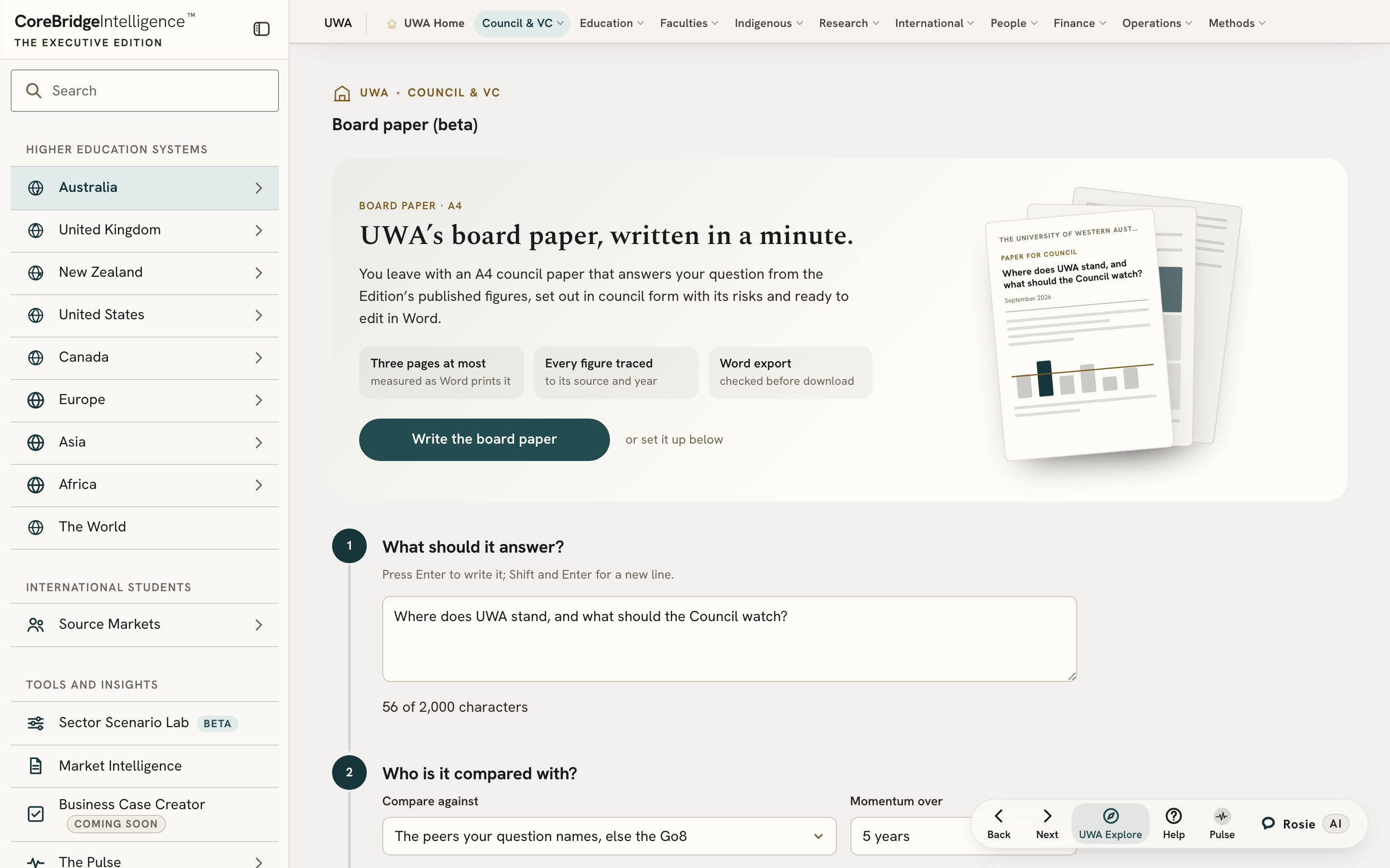
A board paper the Edition wrote on 25 September 2026 for Eastbridge University, a fictional name standing in for a real Australian university. The figures are that university’s published data; only the name is changed.
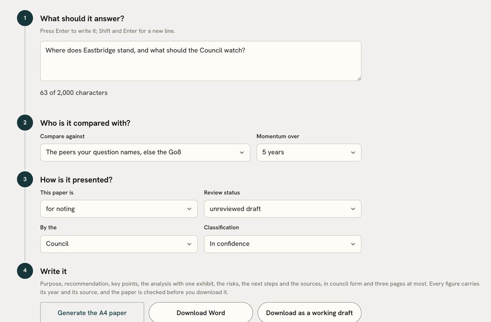

A sample. Figures are the publisher’s latest and may since have been revised. The paper is a draft for review, not advice.
Open a group to see what it holds. Depth differs by provider type and by country, and beta marks a tool still being built out.
Examine institutional position, strategic choices and financial resilience.
Every Australian university, with 123 pages and 1,115 measures each.
How comparison worksCompare financial performance and test the implications of changing assumptions.
A scenario illustrates its assumptions. It is not a forecast.
How scenarios workConnect program and faculty performance with student and employment demand.
Faculty and field pages read Australian universities today.
What you can investigateExamine research strengths, funding patterns and prospective partnerships.
Partner records come from ARC projects, 2002 to 2026.
What you can investigateCompare systems and institutions, investigate sector pressures and explore policy scenarios.
Descriptive comparisons. A scenario shows the effect of its assumptions, not the effect of a policy or law.
How scenarios workExamine skills demand, regional context and the provider measures available.
TAFE coverage is narrower than university coverage today.
How comparison worksInvestigate institutions, course portfolios and student markets.
Public evidence is an input to commercial work. It does not show recruitment costs, conversion or contract terms.
What you can investigate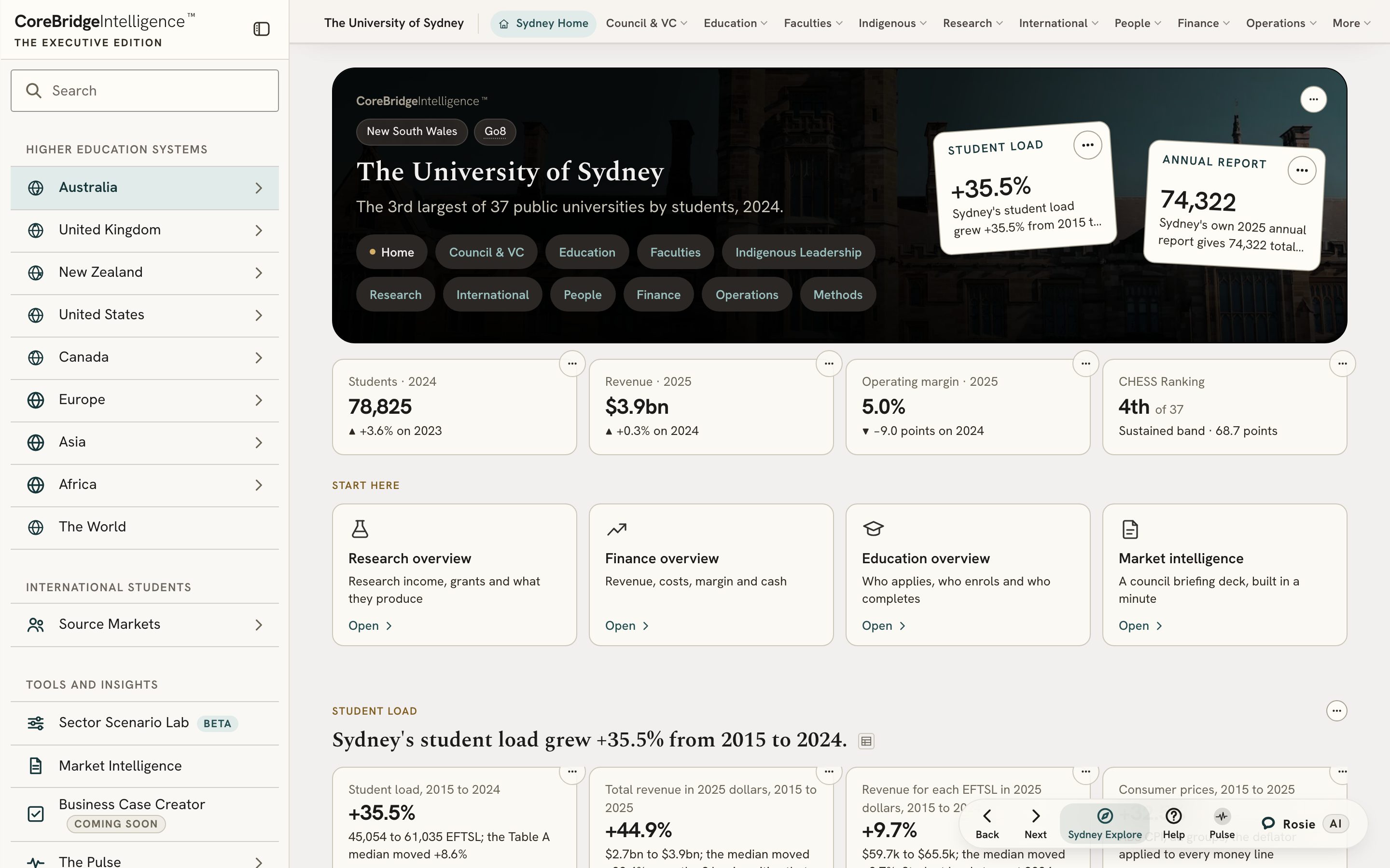
Depth differs by provider type and by country. Each panel says what the Edition holds for that audience today.
Each about a minute long, narrated by Rosie and made from the platform’s own screens.
On your phone
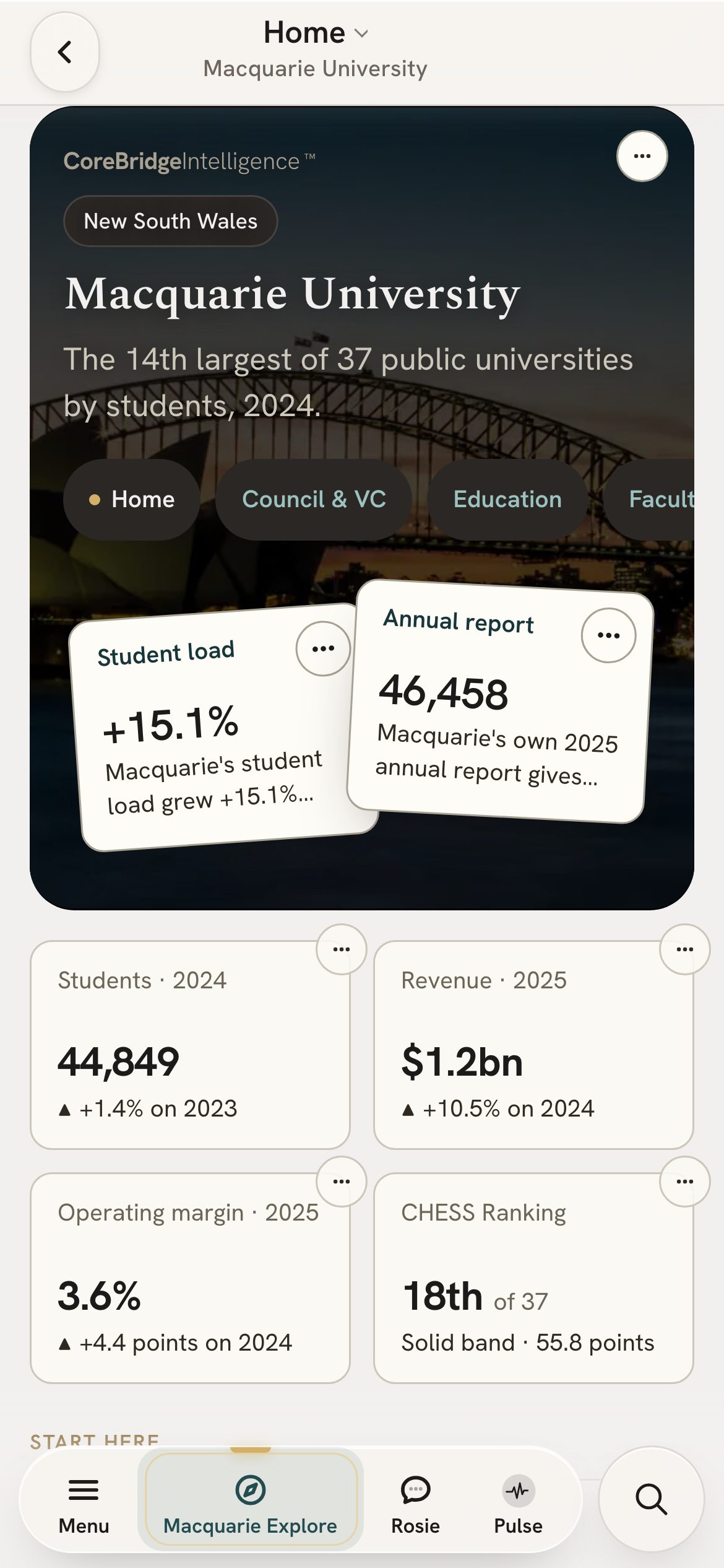
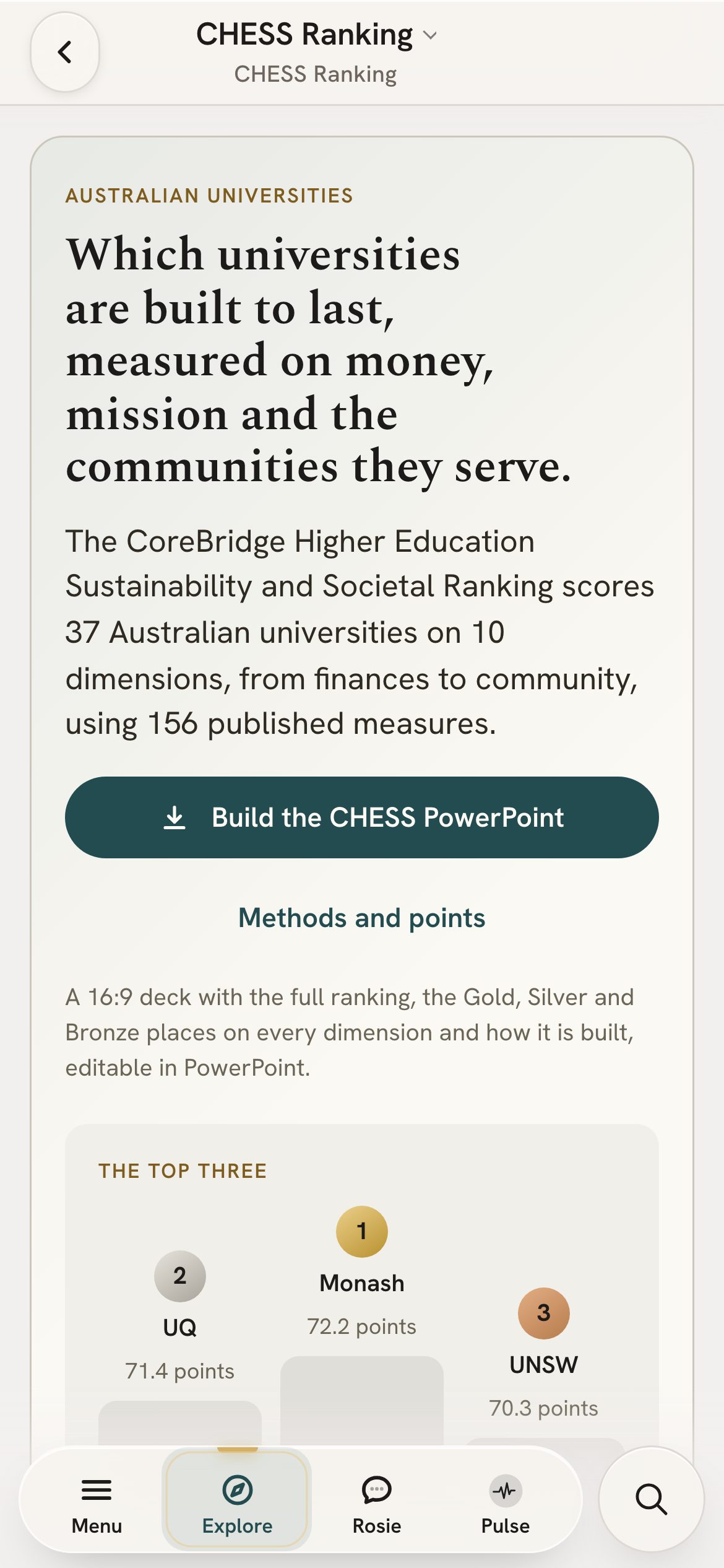
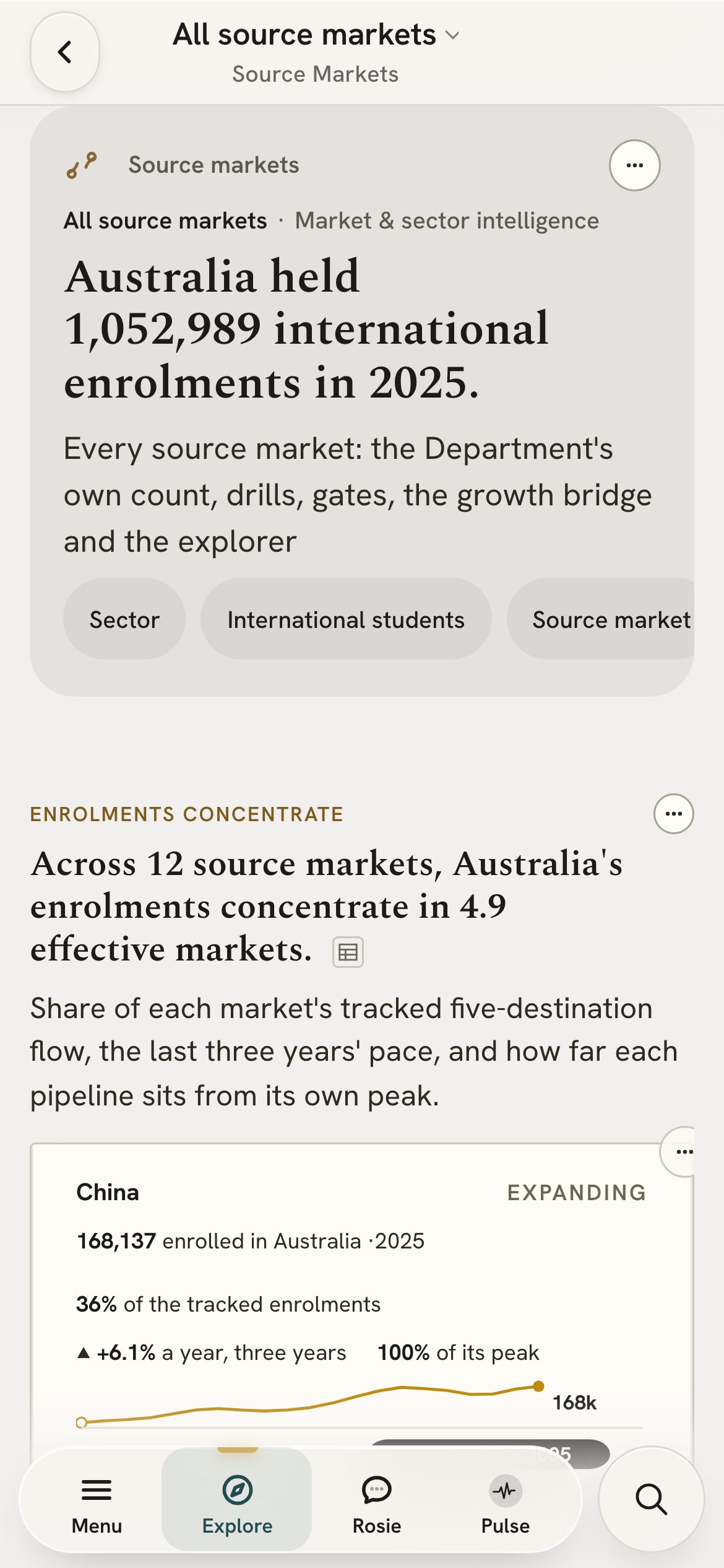
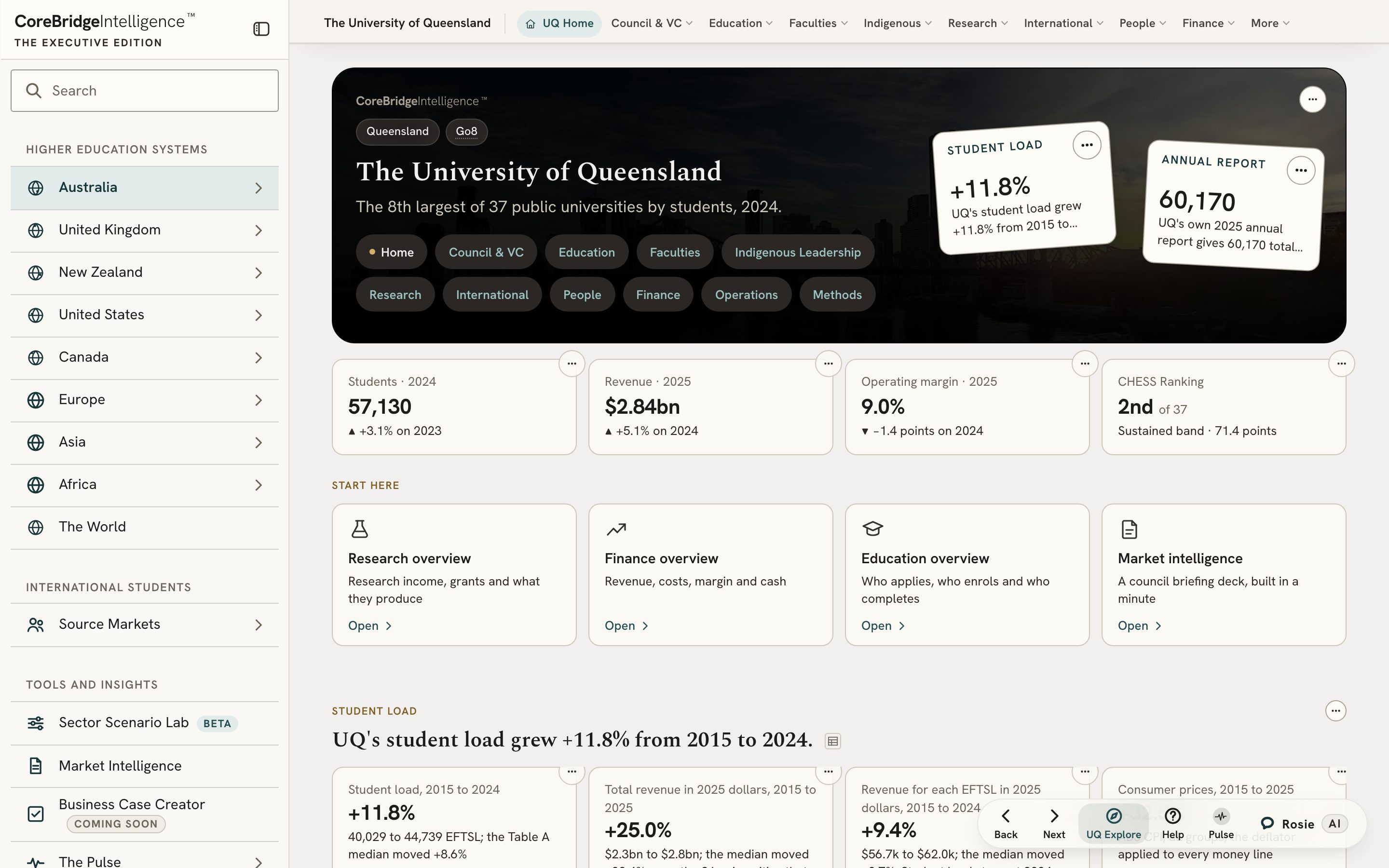
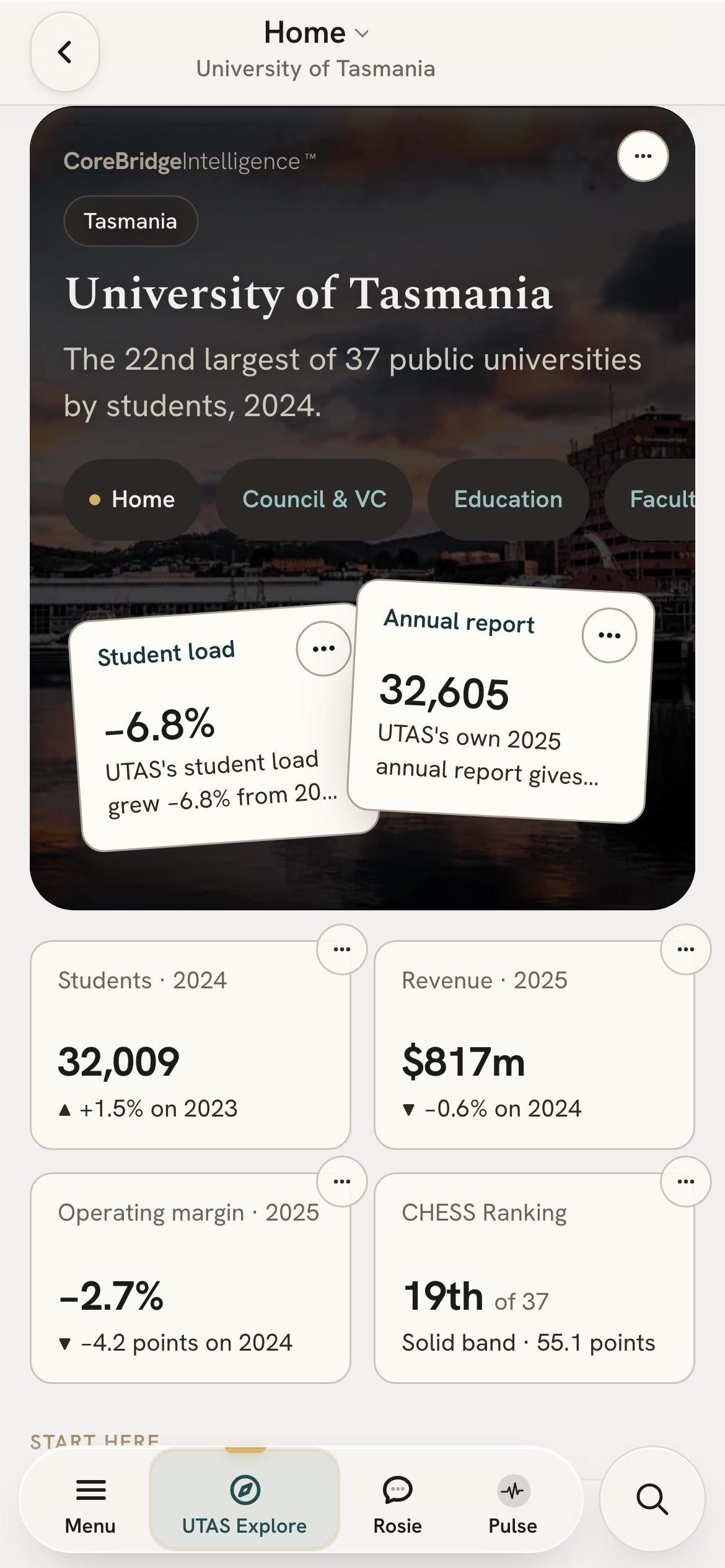
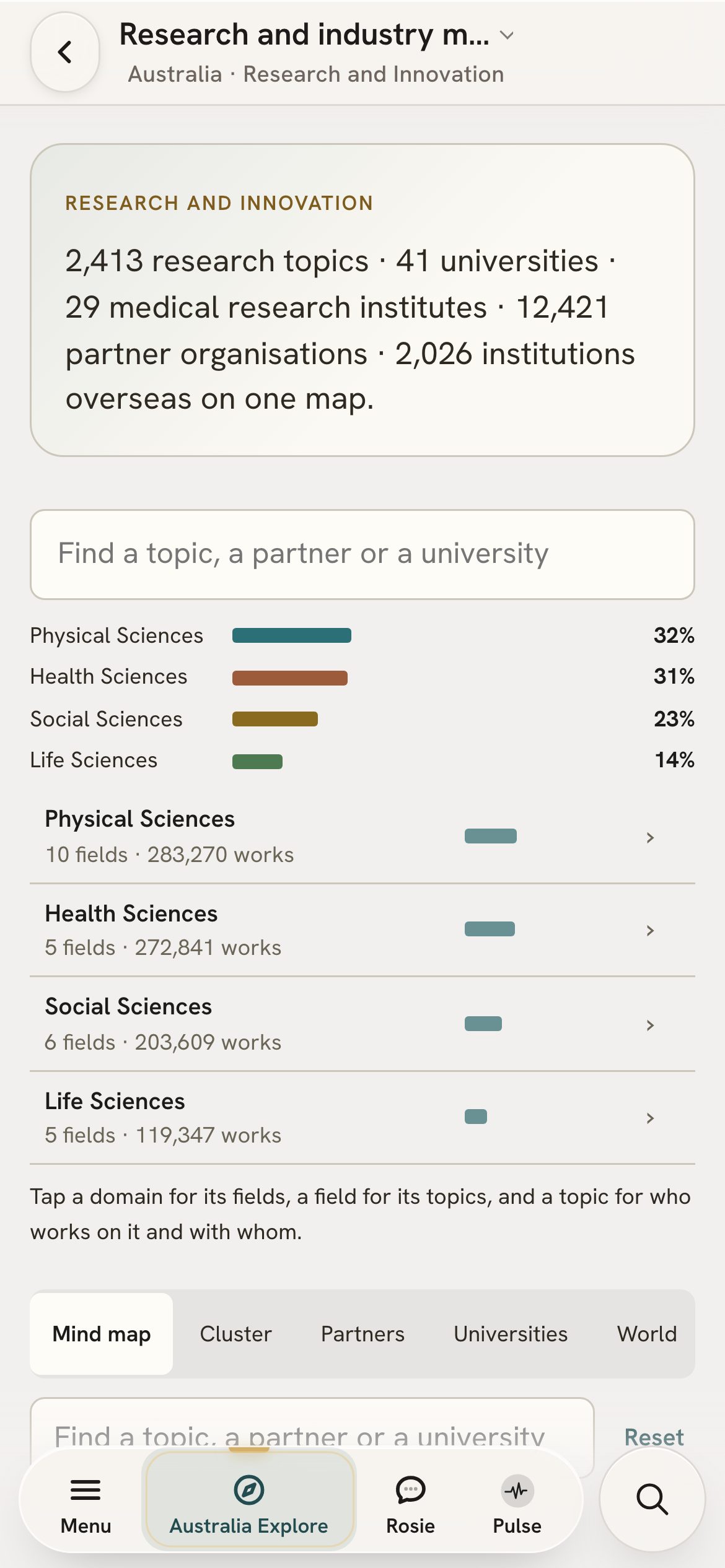
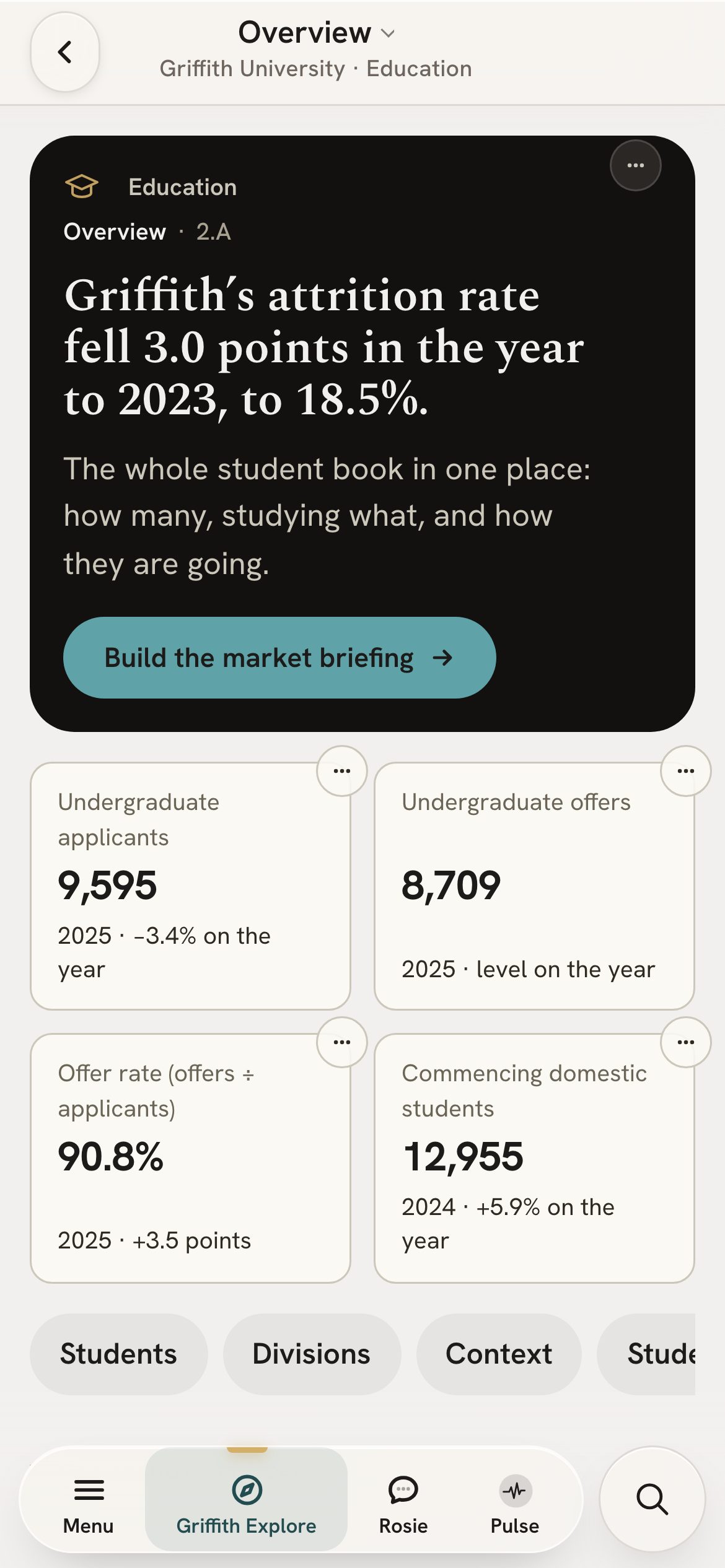
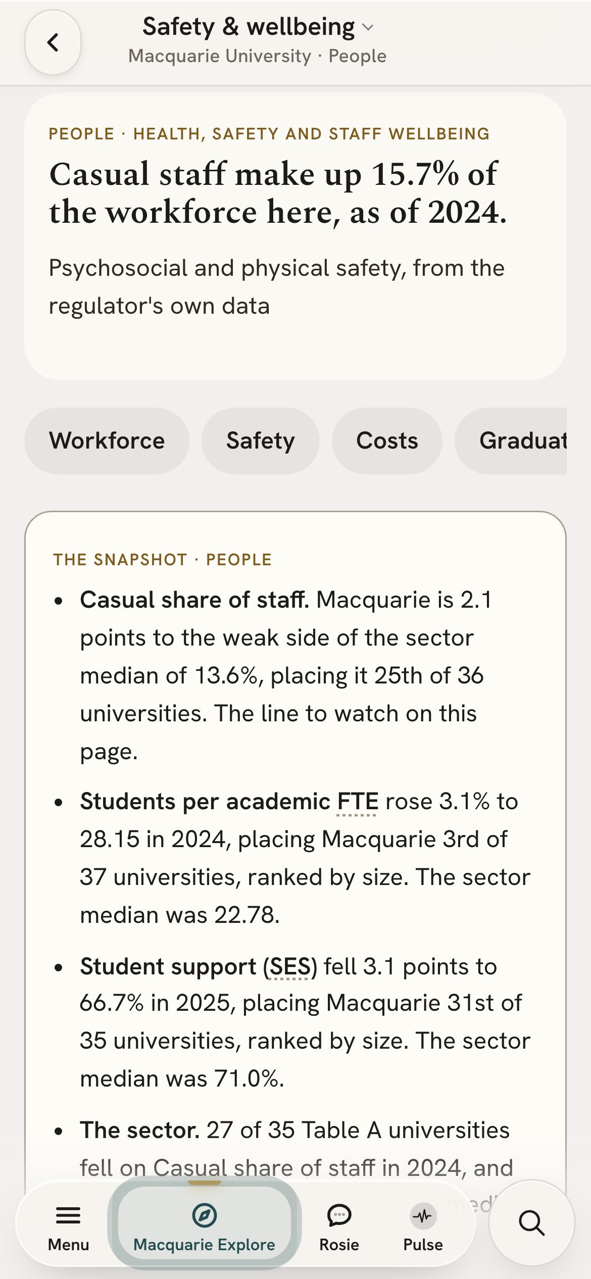
Board papers, the CHESS Ranking and Rosie all open on a phone. Every figure and source is the same as on the desktop.
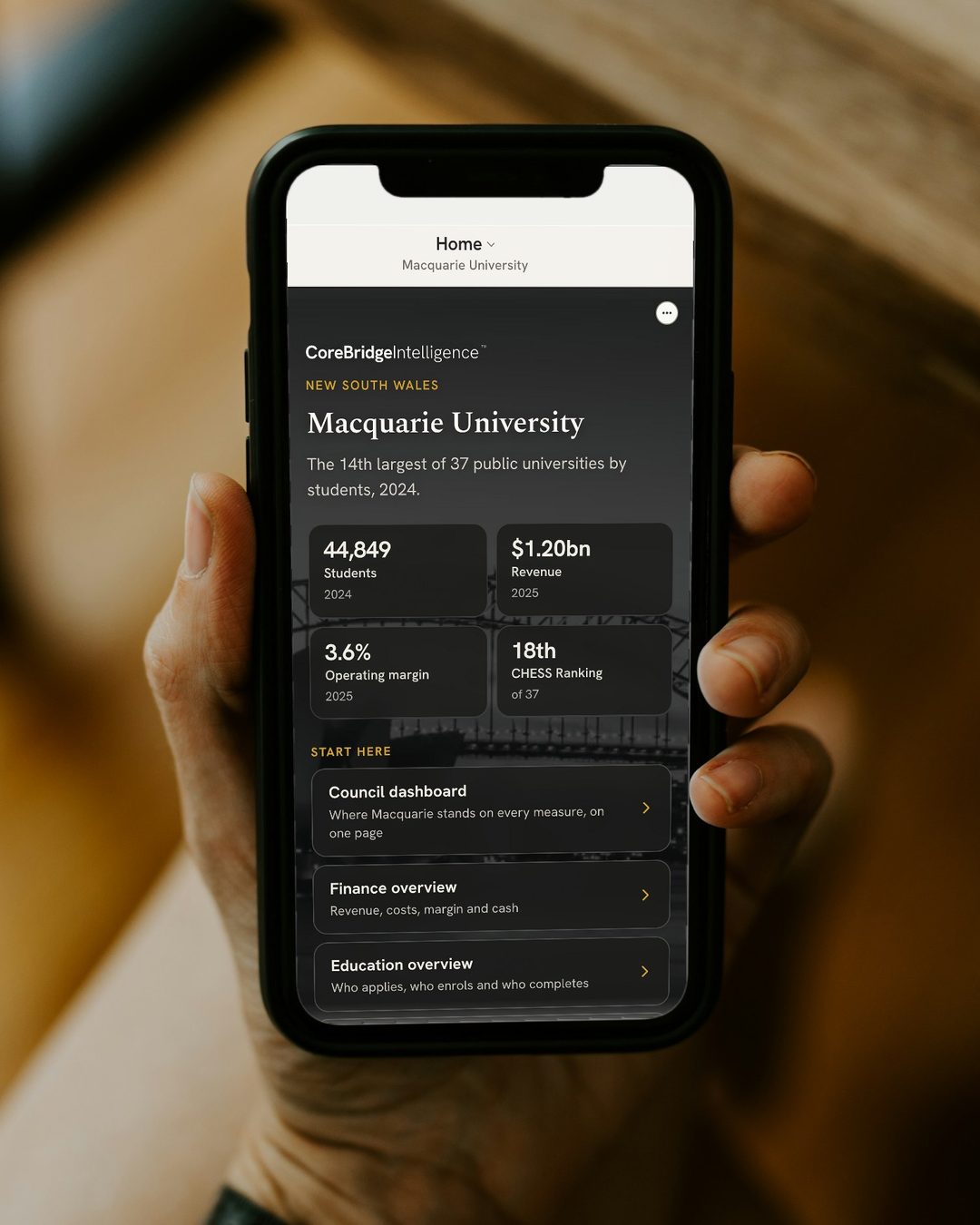
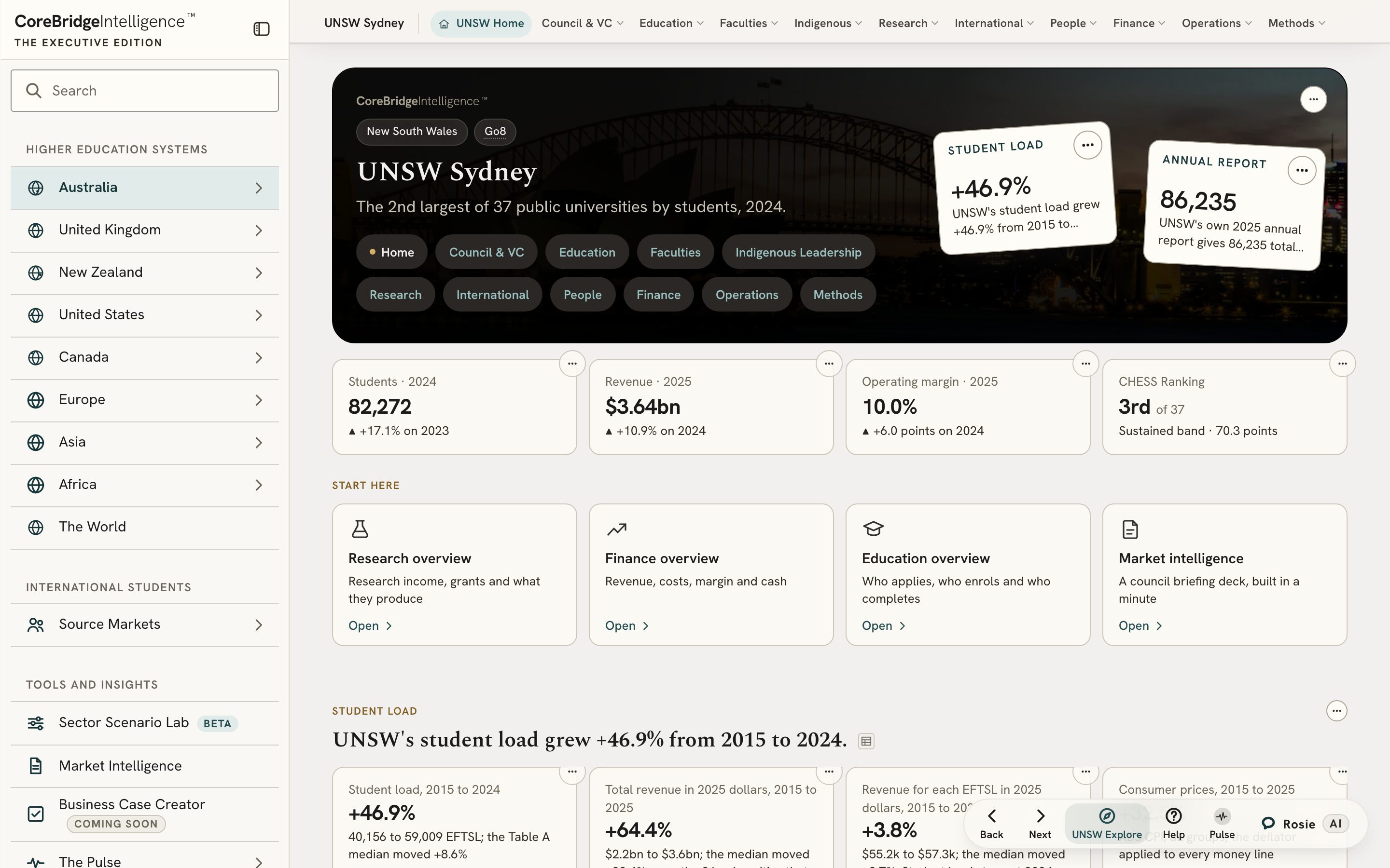
The front page. Your university’s numbers, ranked against the whole sector, the moment you sign in.
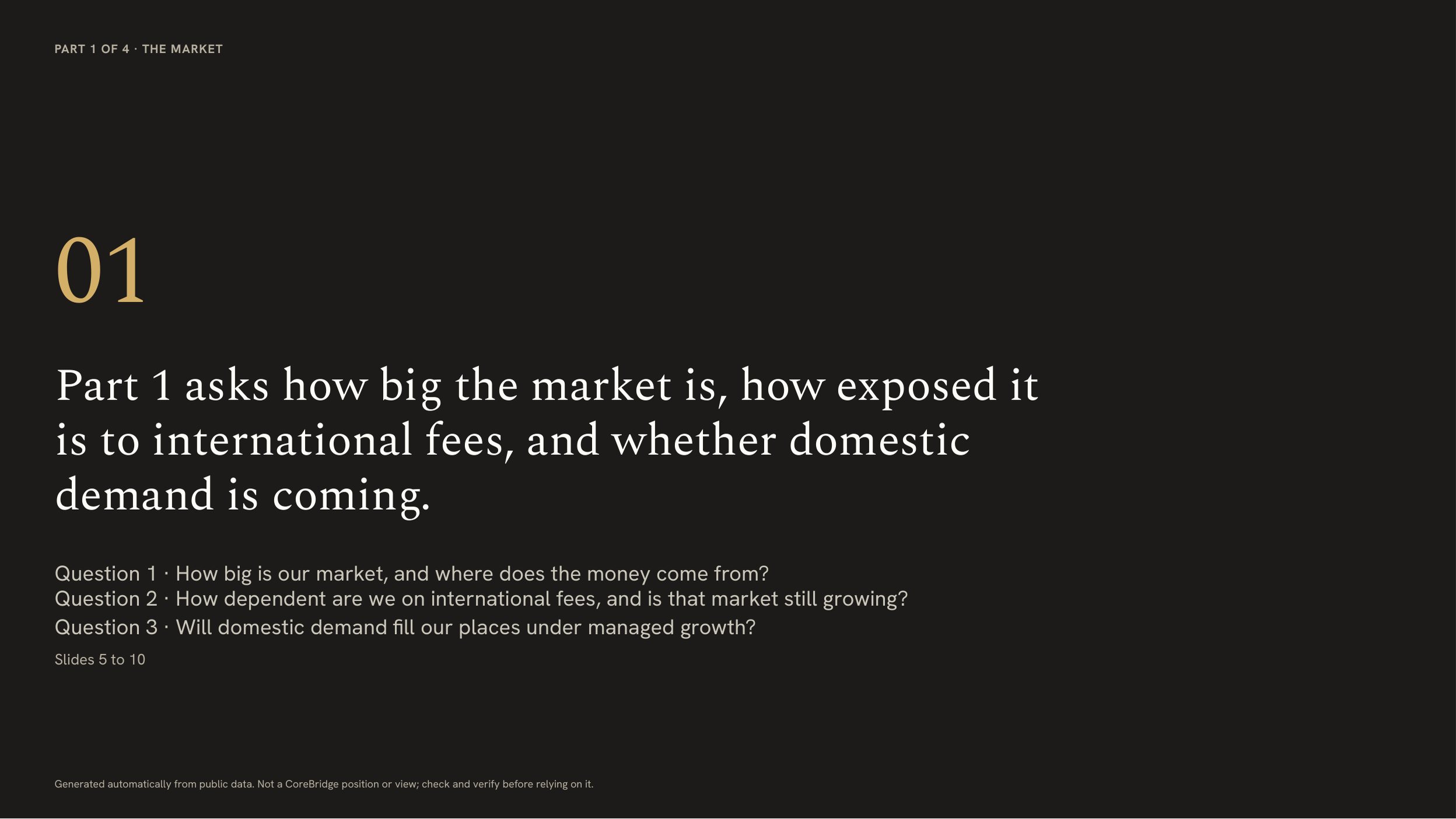
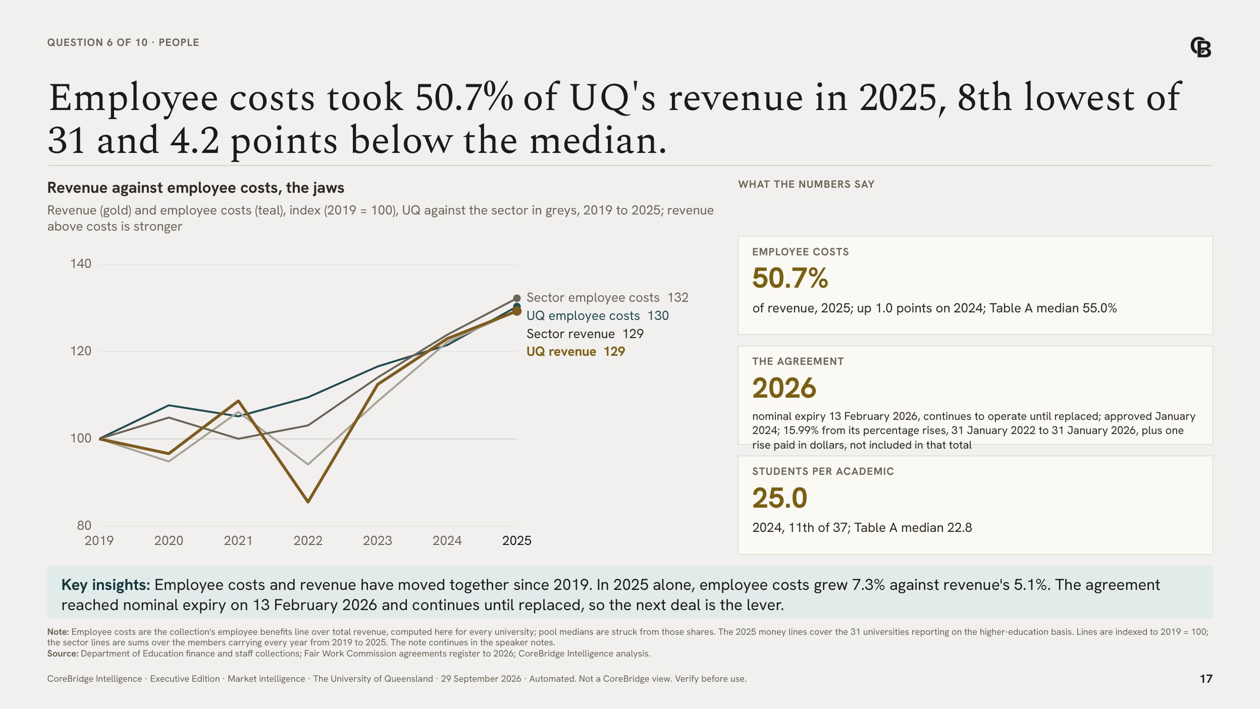
Market Intelligence. Ten questions a chair asks, each answered on its own slide.
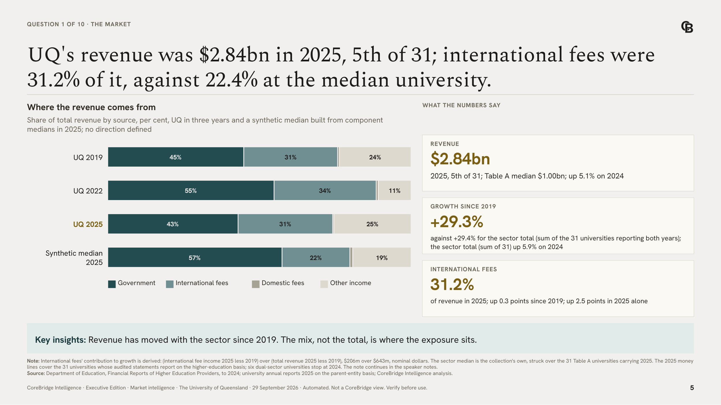
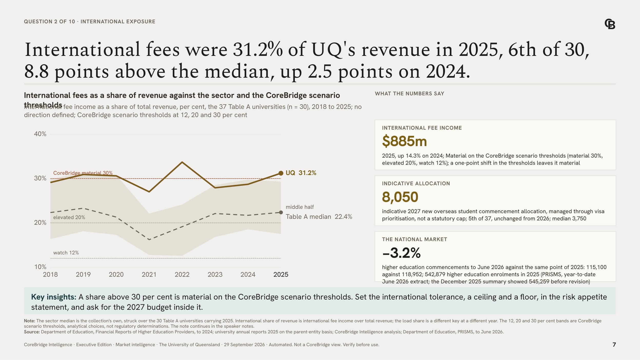
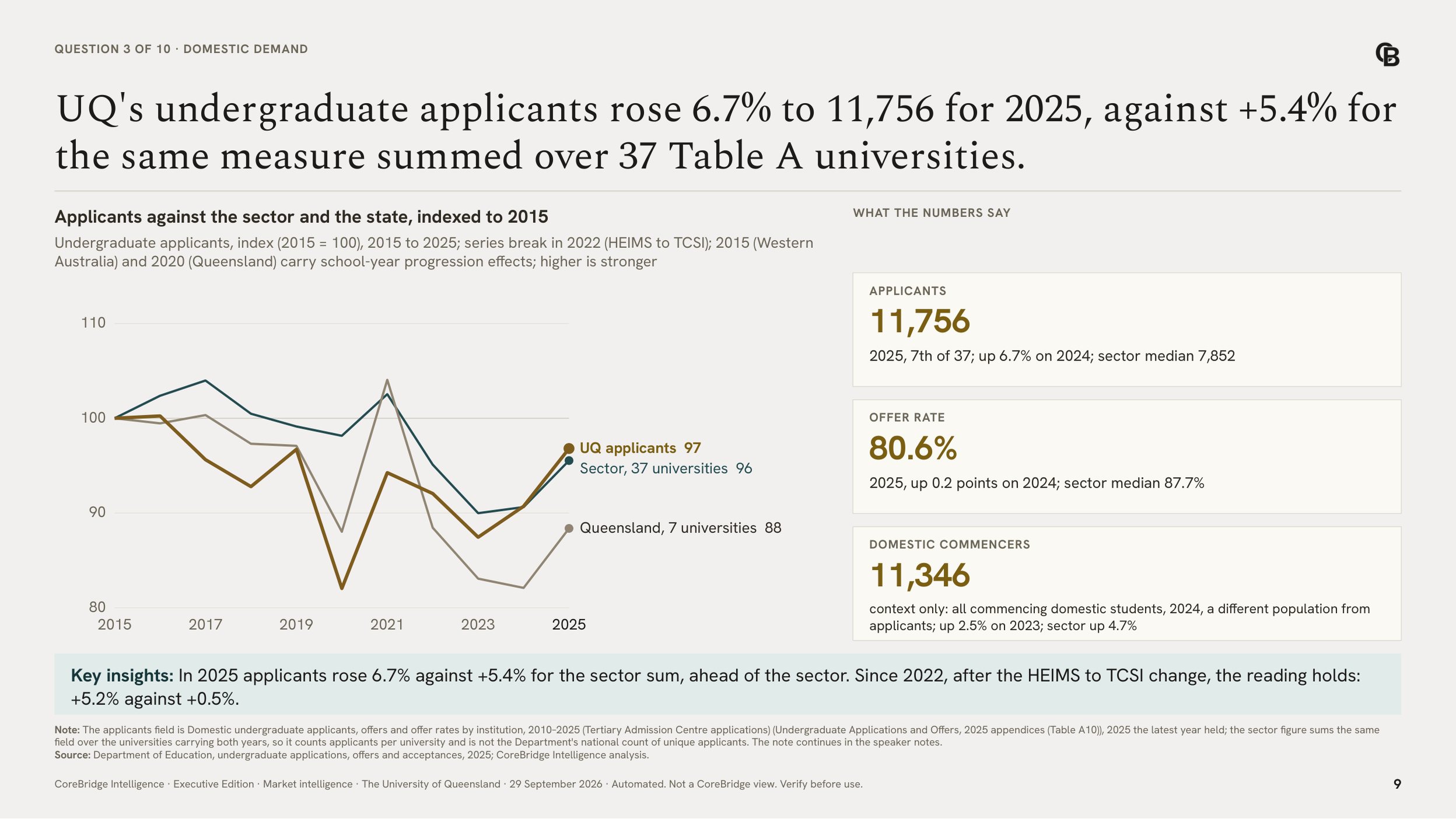
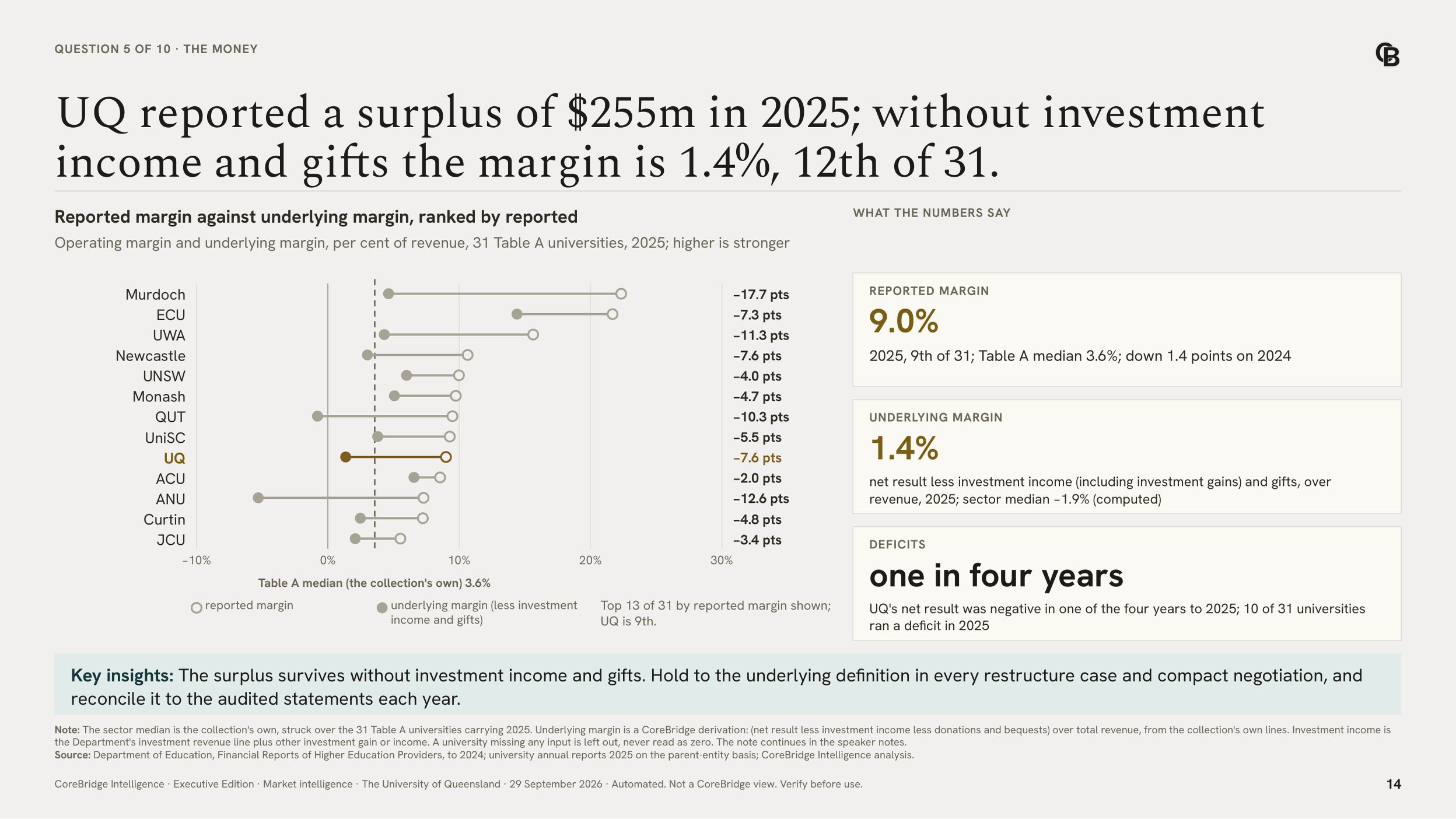
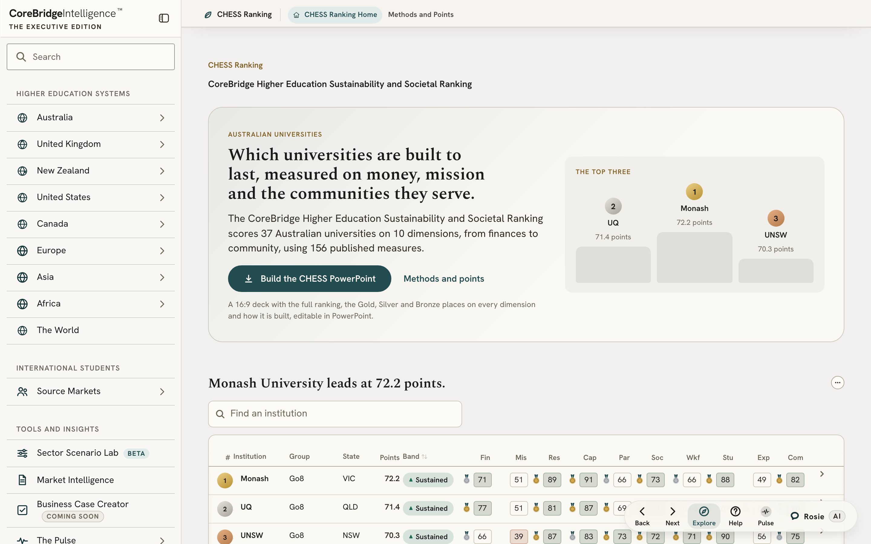
The CHESS Ranking. Universities ranked on finance, mission and community.
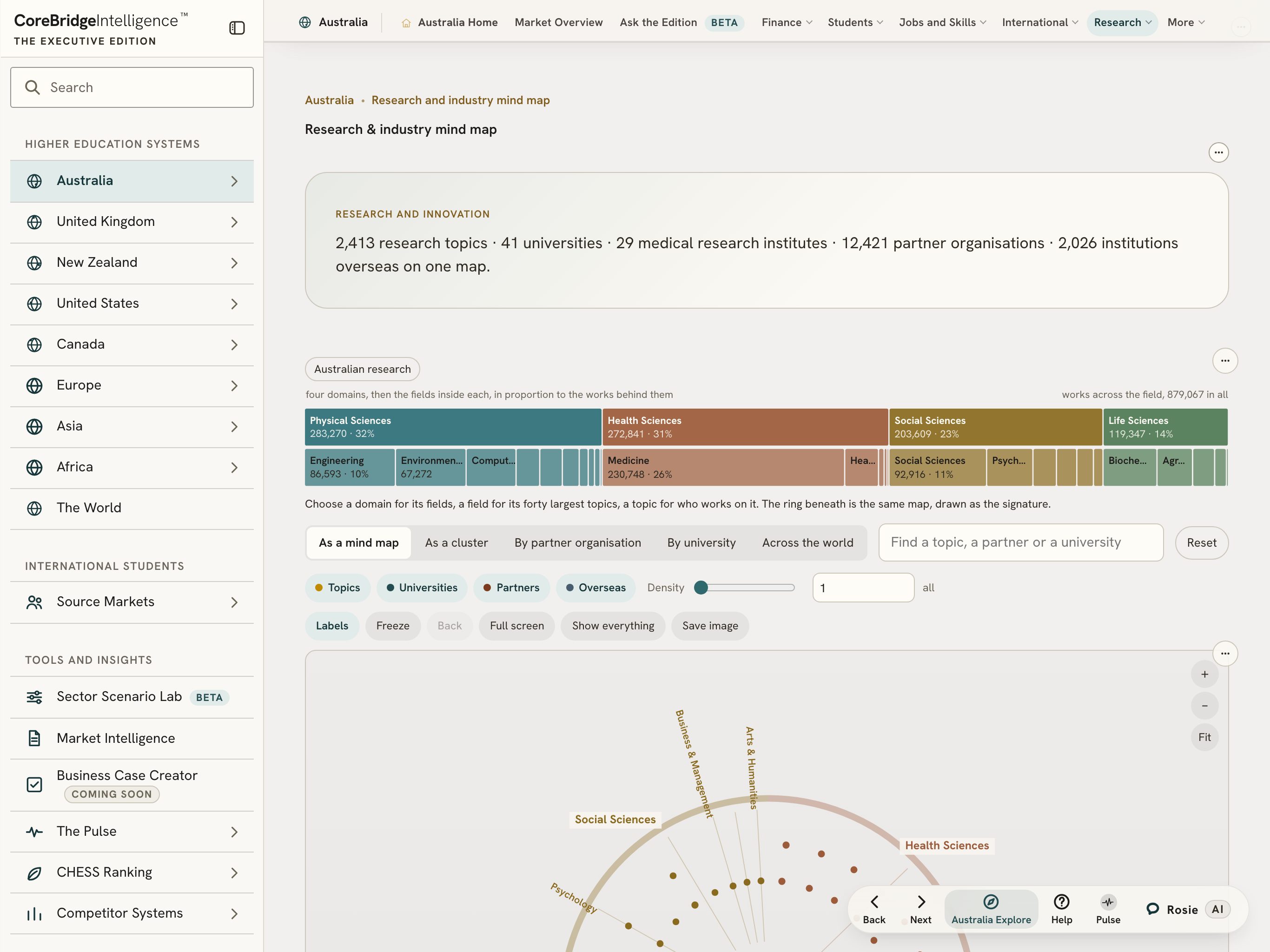
The research map. Fields, funders and industry partners, connected on one page.
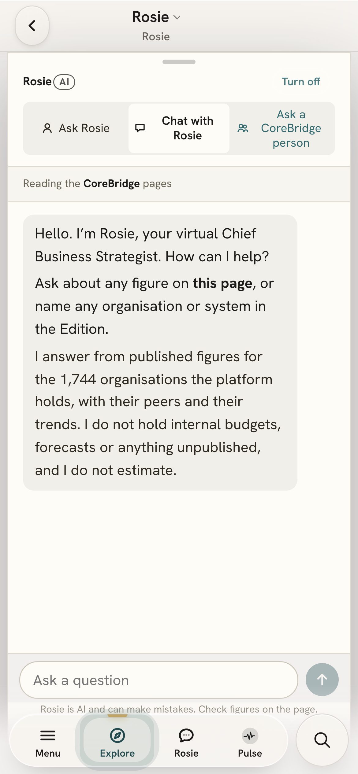
Rosie. Your virtual Chief Business Strategist, on every page.

Board papers
Type the question your Council is asking. The Edition writes a one or two page paper in council form, compares you with your nearest peers and names every source. It opens in Word for you to check and edit.

Scenarios
You set the change: fewer students from one country, a visa rule, a funding freeze or a pay rise. The Sector Scenario Lab and the CFO model apply it to each university’s published accounts over the next five years. Change the assumptions to explore their modelled effects. Scenario results illustrate those assumptions; they are not forecasts or statements of CoreBridge’s preferred policy. The base year and the inputs are shown on the page.
Meet Rosie, your virtual Chief Business Strategist.
Rosie works like a strategist at your side. Talk a question through, test an idea before the meeting, or think aloud about what a trend could mean for your institution. Type to her on any page, or talk to her on video.
Rosie is AI and can make mistakes.
Think it through, on any page. Ask what a page could mean for your plans, and Rosie works through it with you.
Ready for the room. Rehearse the hard question before the meeting, or ask how your peers might read the same trend.
Australia, the United Kingdom and New Zealand, in full, with no sign-in.
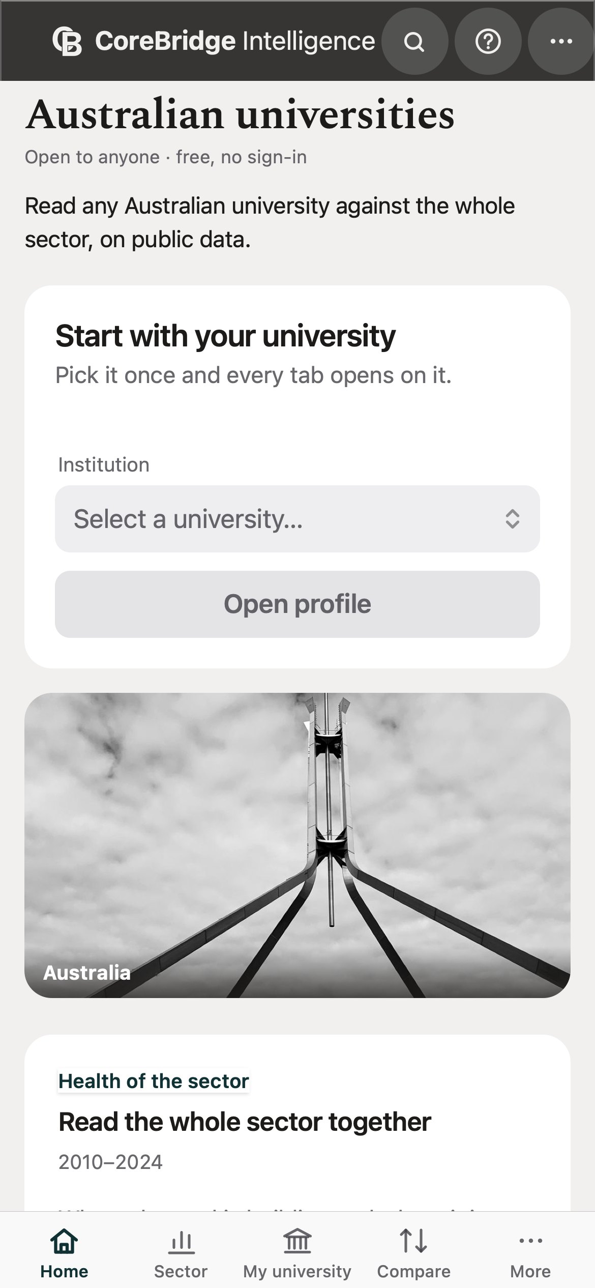
Purpose, recommendation, key points and the evidence, against your nearest peers.
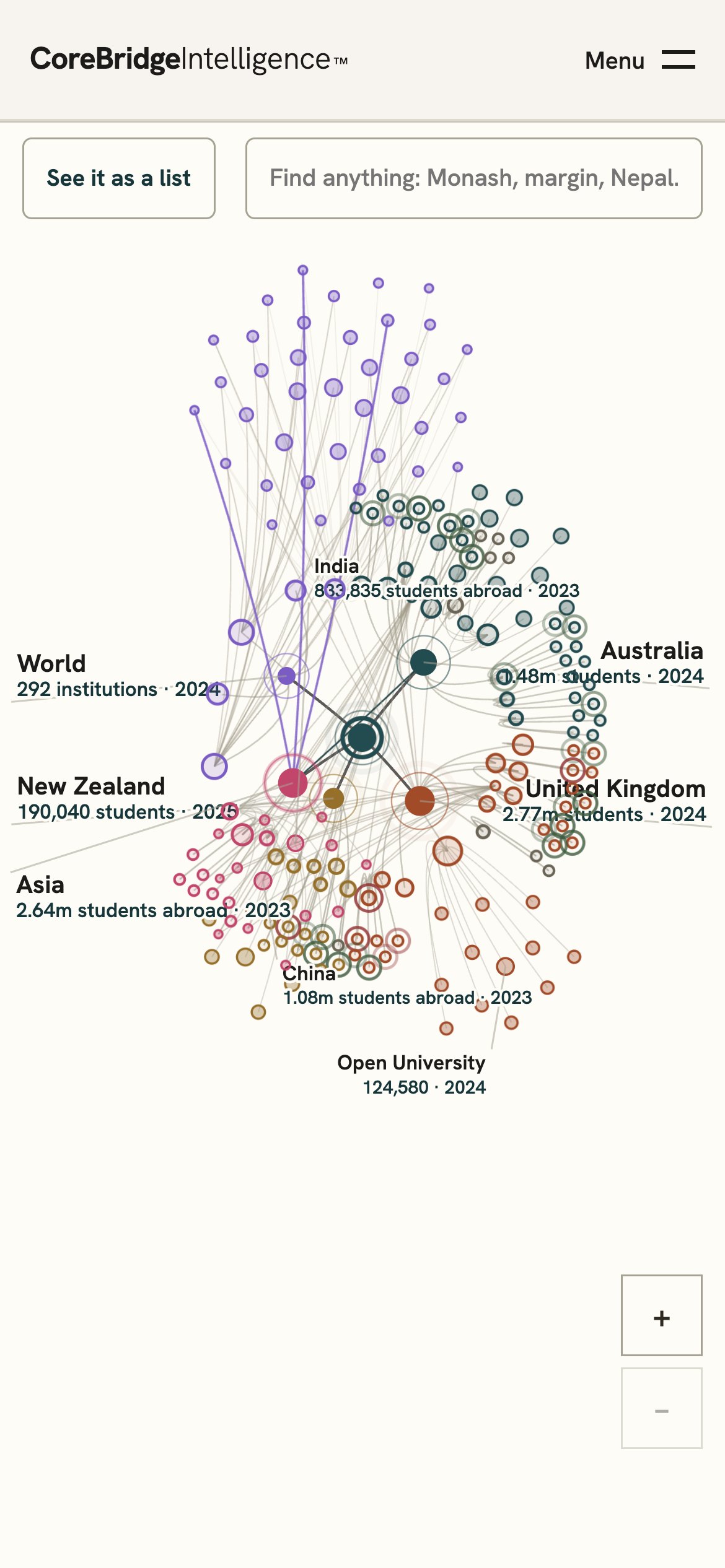
Institutions, source markets and research partners, with the flows between them.
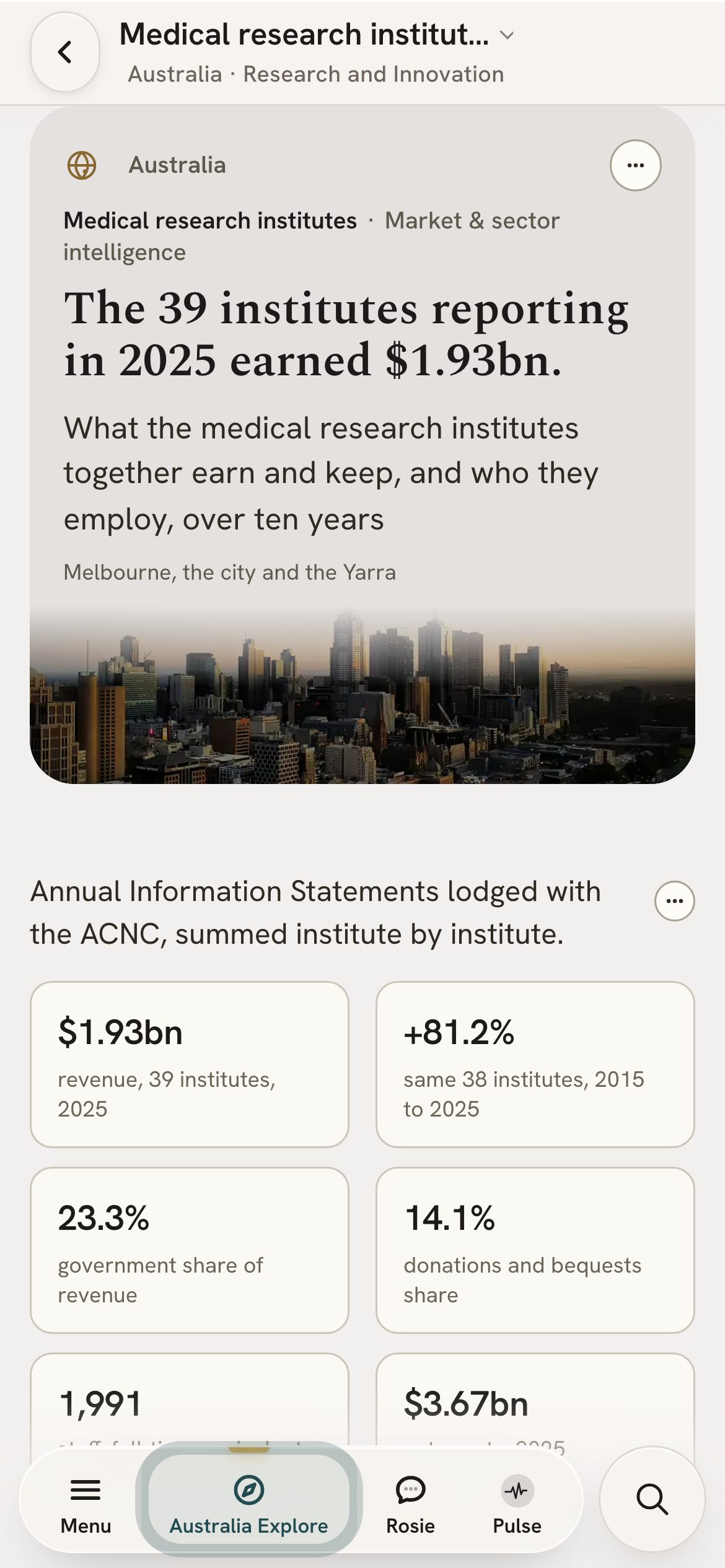
Grants, money and people for 39 institutes reporting in 2025.
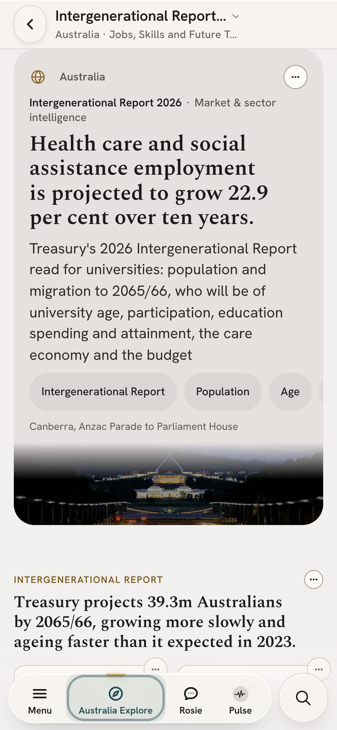
Treasury’s population and workforce outlook, read for tertiary education.
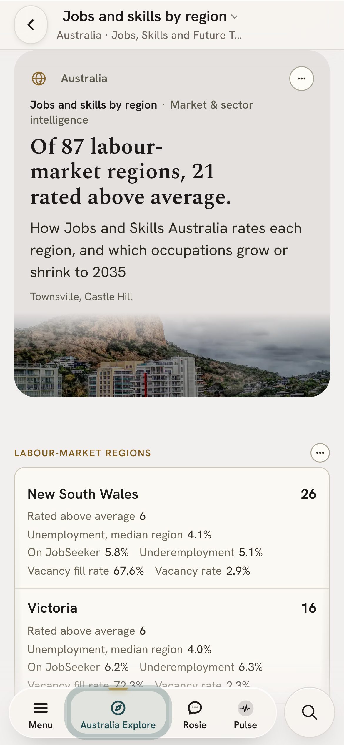
Jobs and Skills Australia vacancies and projections, region by region.
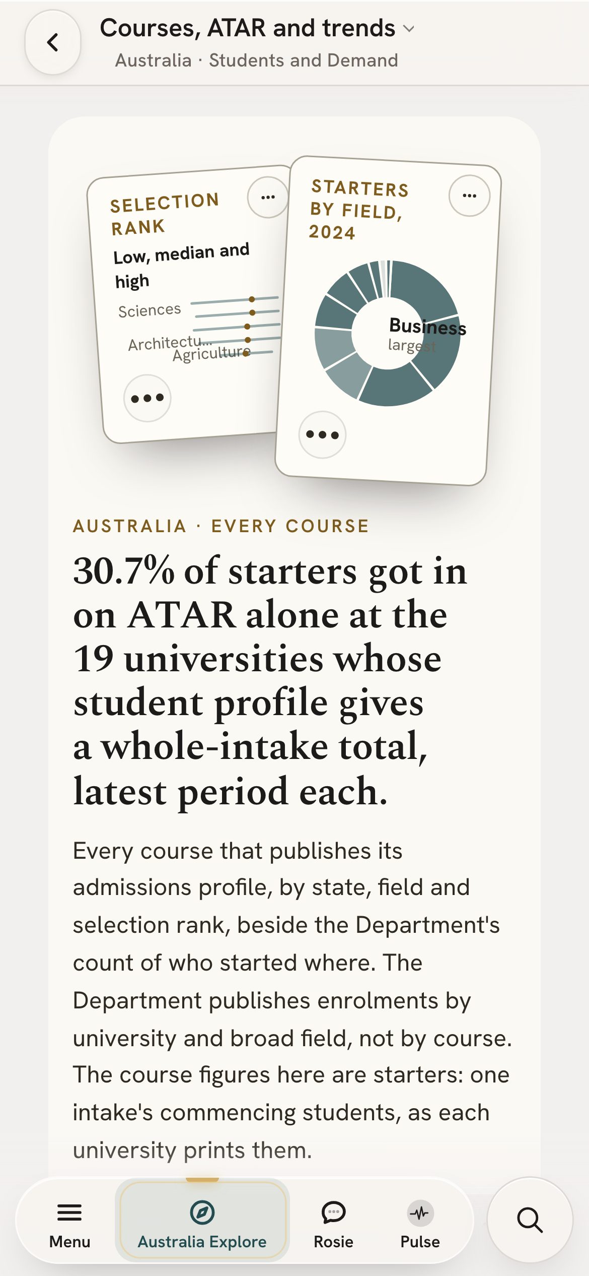
Starters by field, ATAR and the courses each university offers.
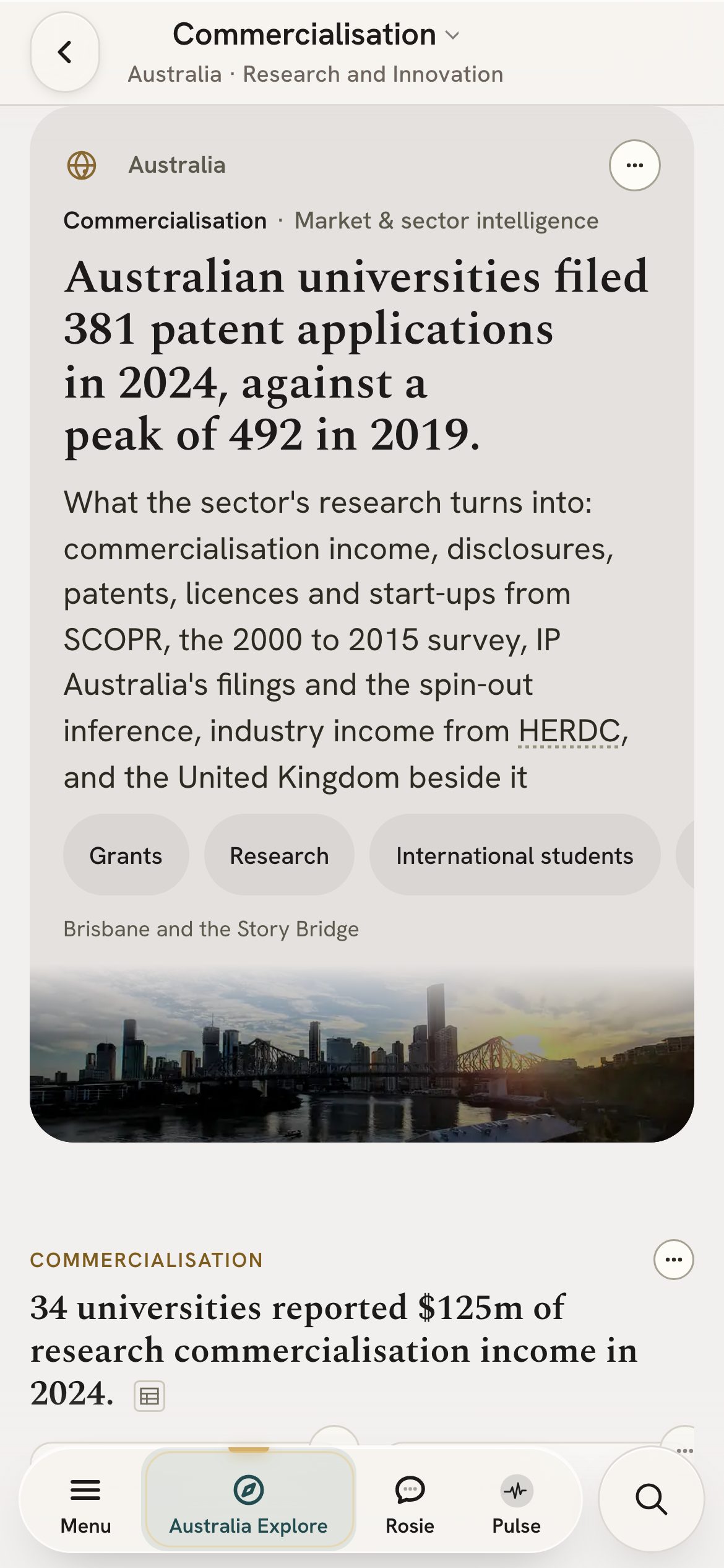
Commercialisation income against research spend, for every university that reports it.
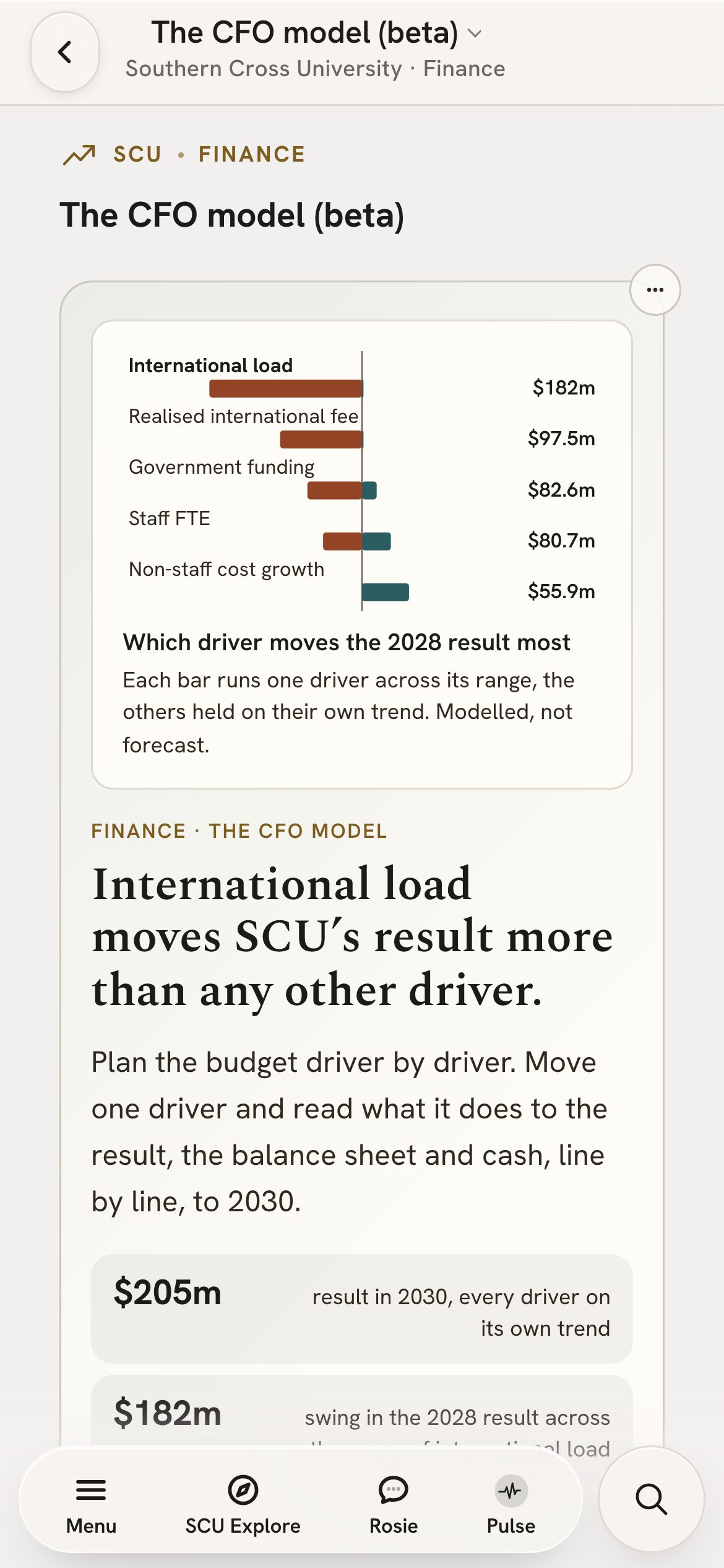
A five-year financial scenario from your published accounts, with the driver that moves it most.
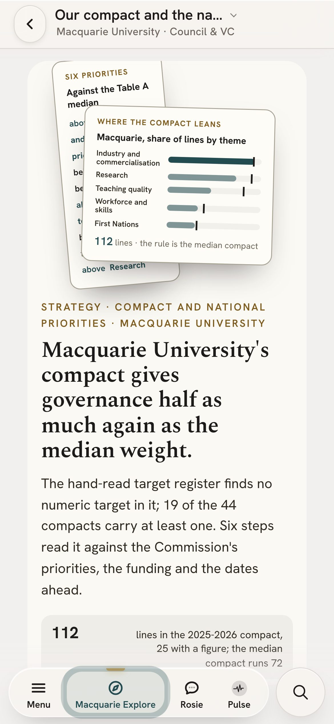
The compact and the national priorities, set against your own figures.
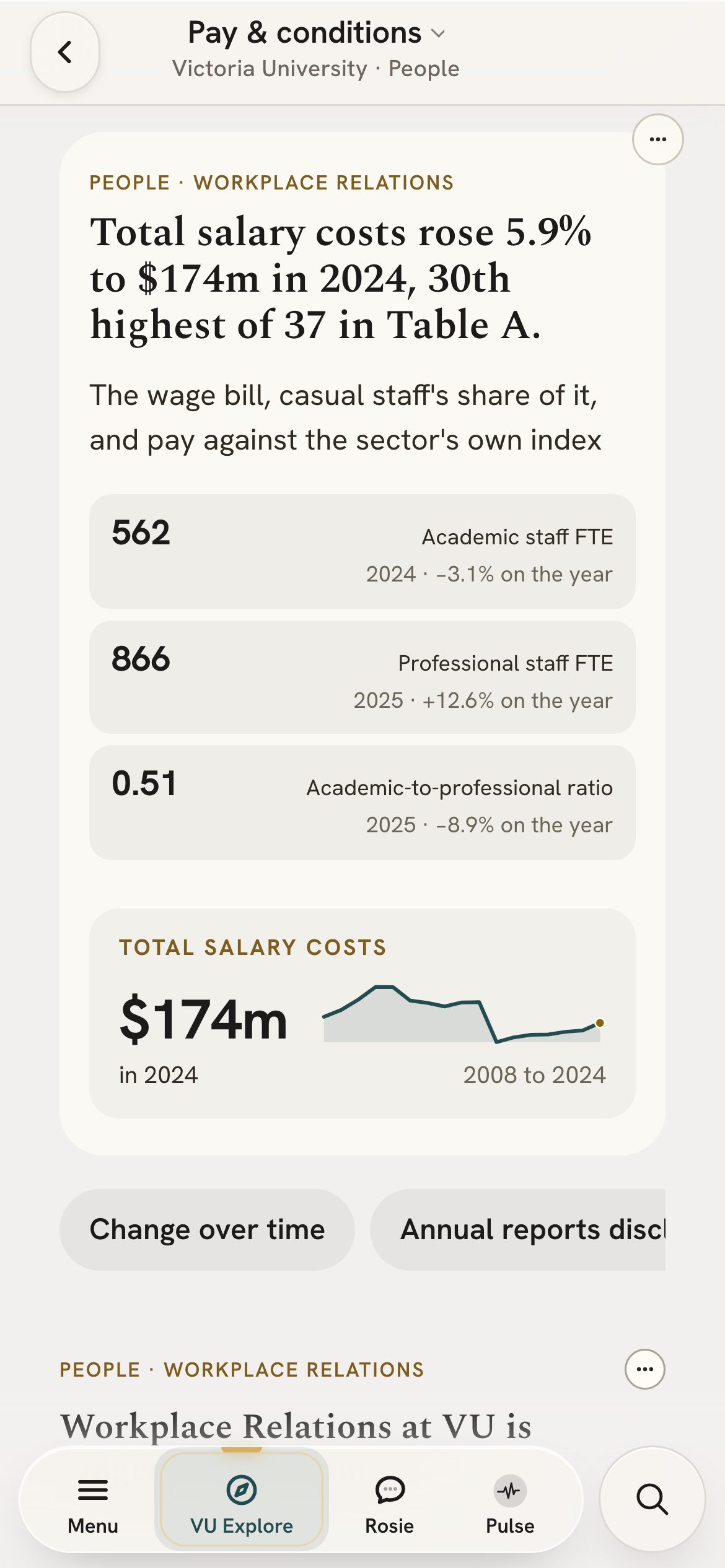
Enterprise agreements read into pay scales, with staff costs against peers.
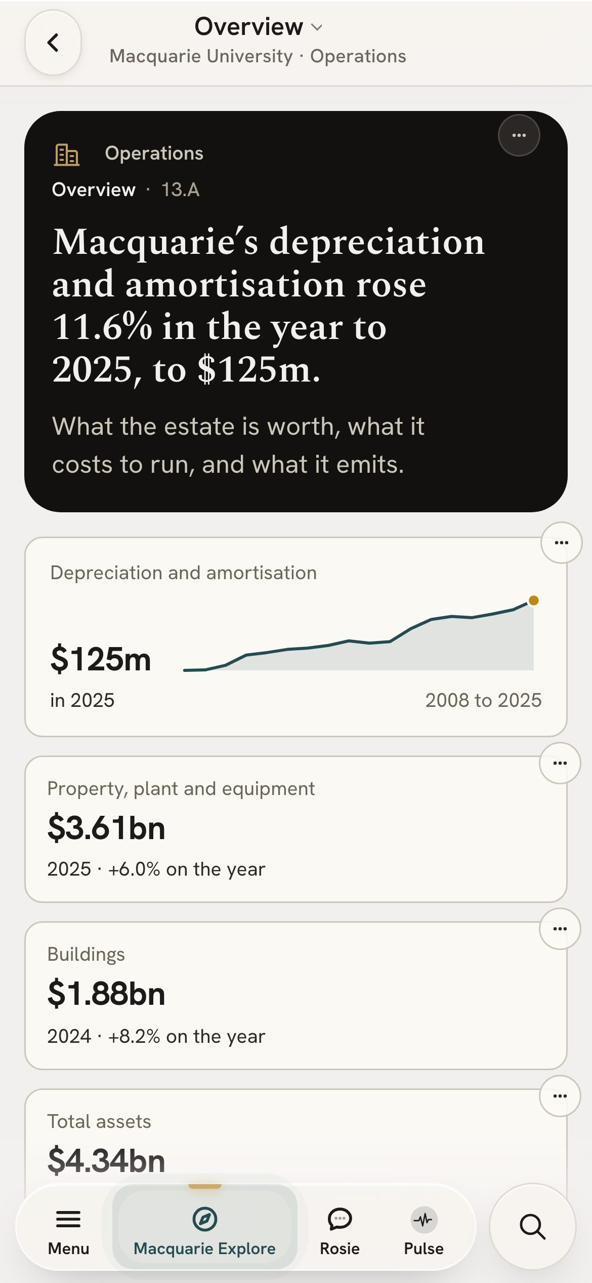
Every campus, its courses and the estate measures behind it.
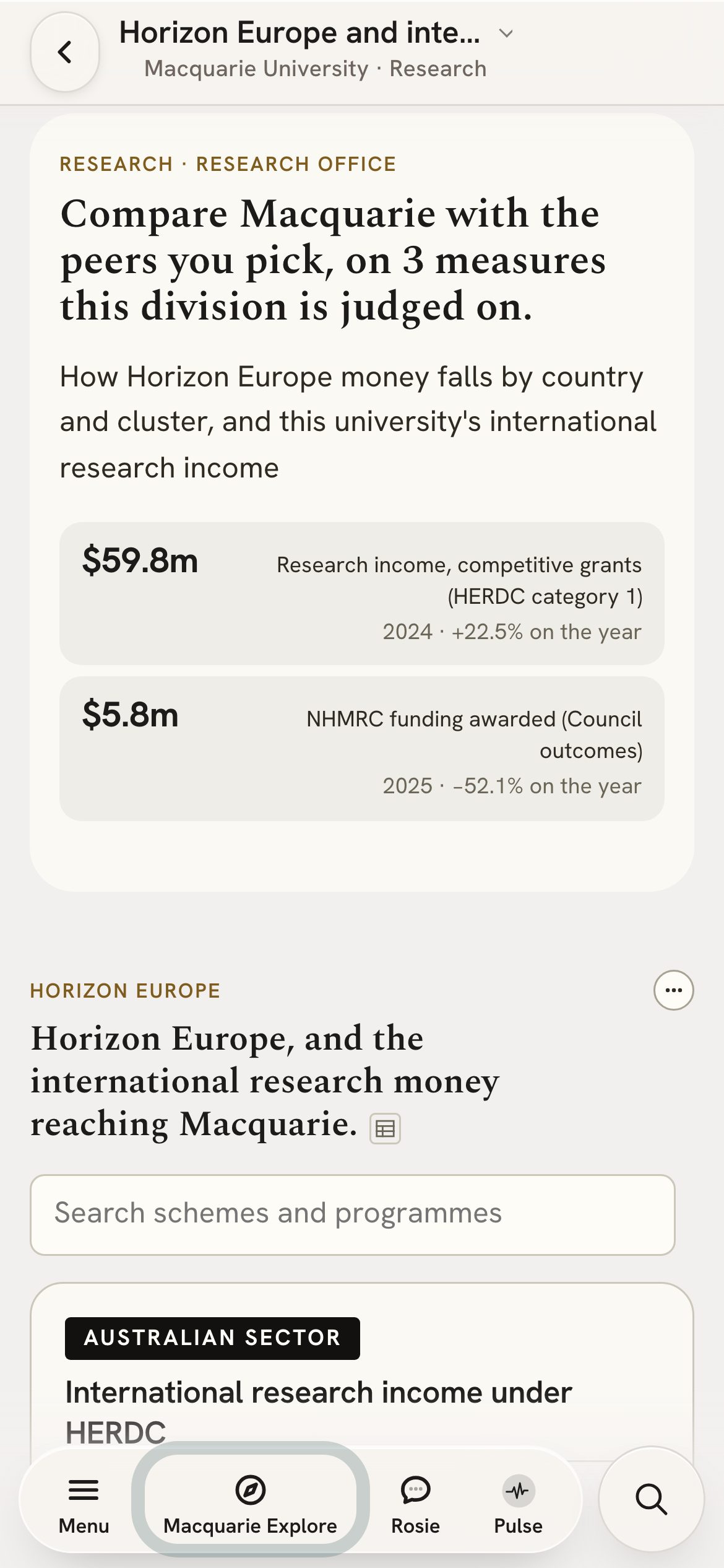
Where Australian universities win Horizon Europe grants, and with whom.
Move one setting and see the next five years for every university.
Each group’s share of students, against the Accord’s 2035 targets.
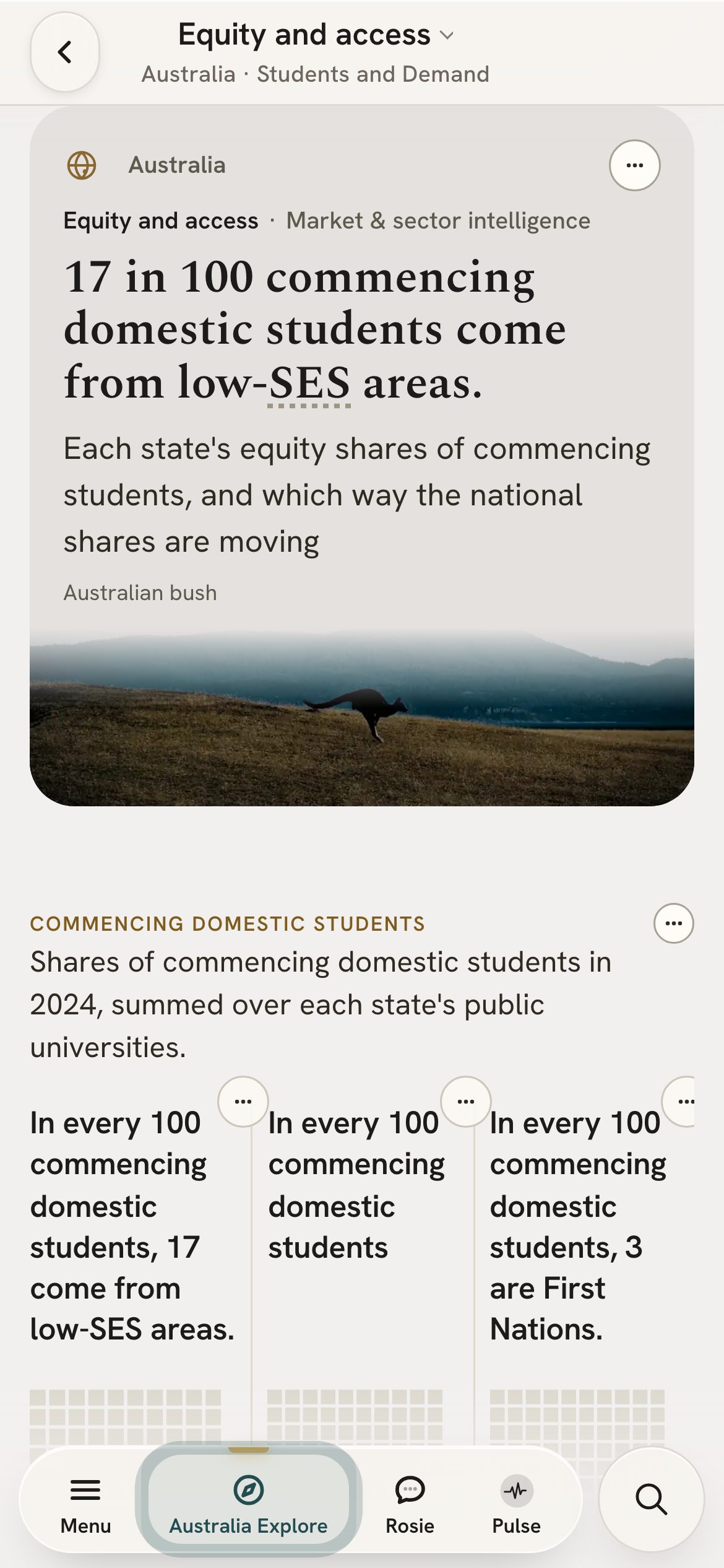
Liquidity, insurance and the measures a risk committee watches.
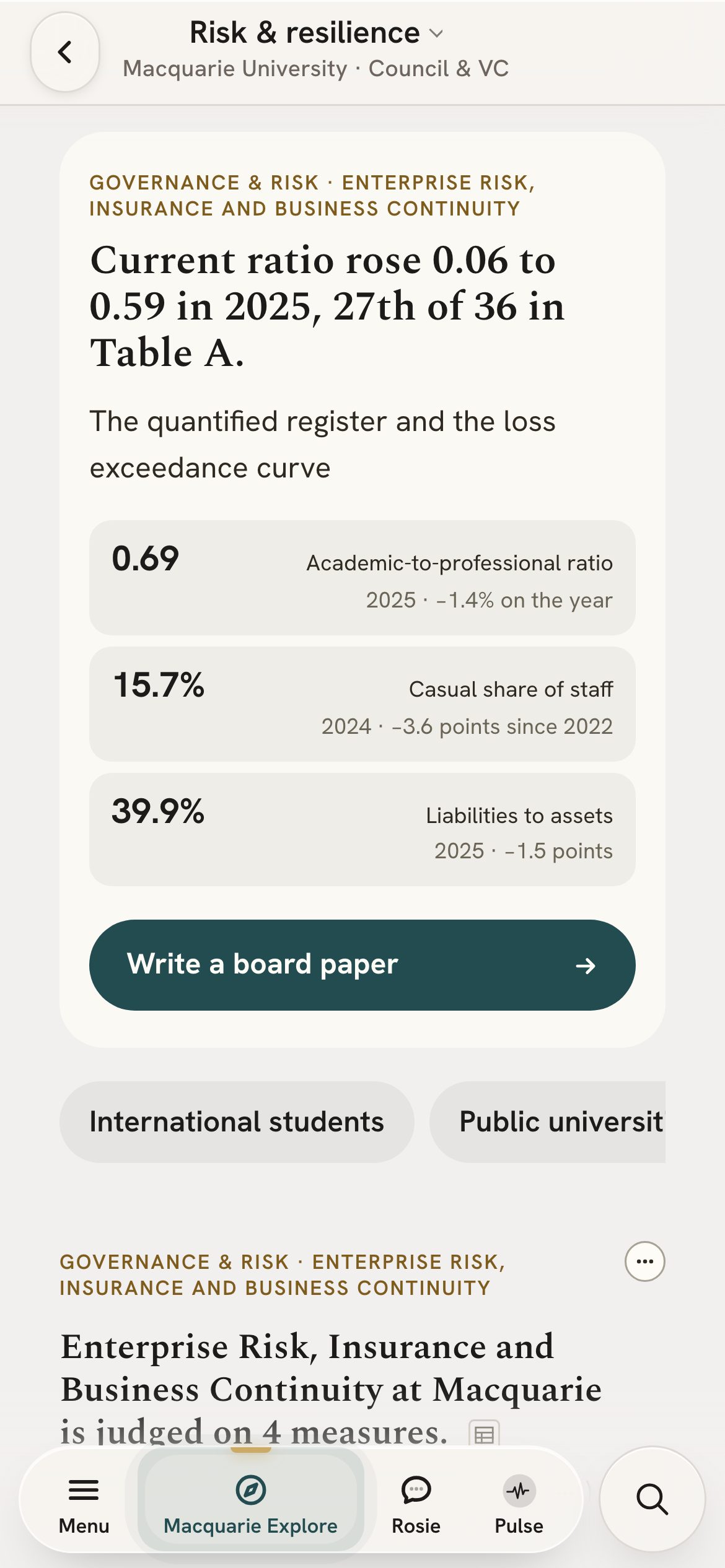
Rank any measure across 157 providers, follow its trend, or set two head to head.
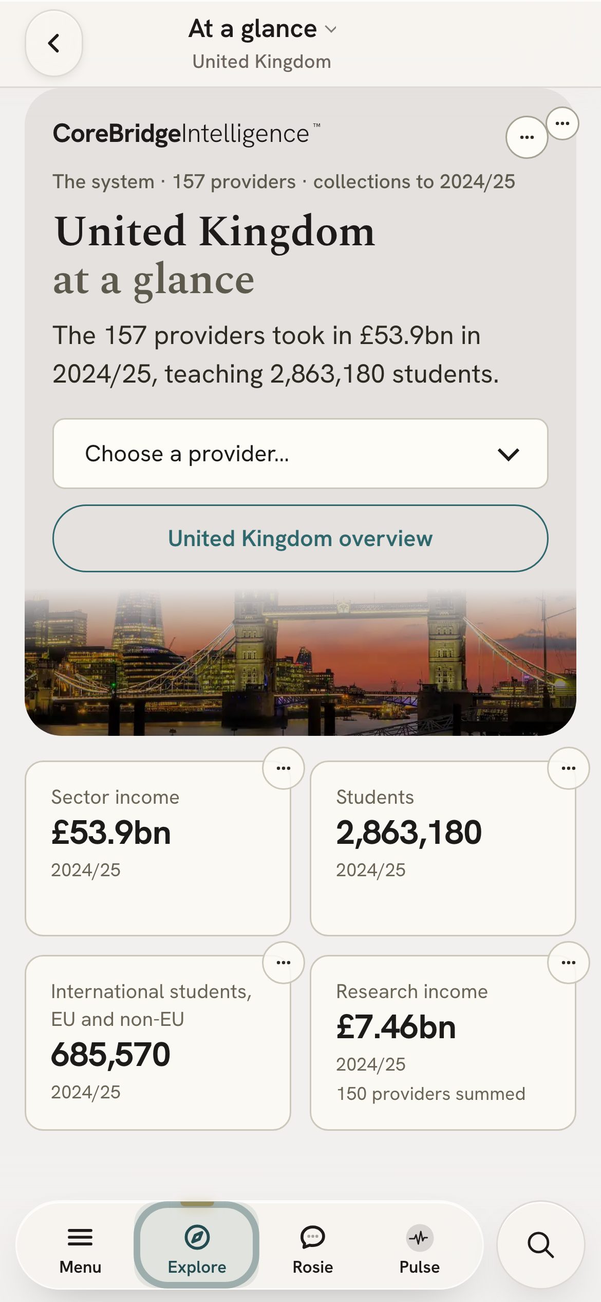
Rank and compare New Zealand’s universities on any measure, against the system median.
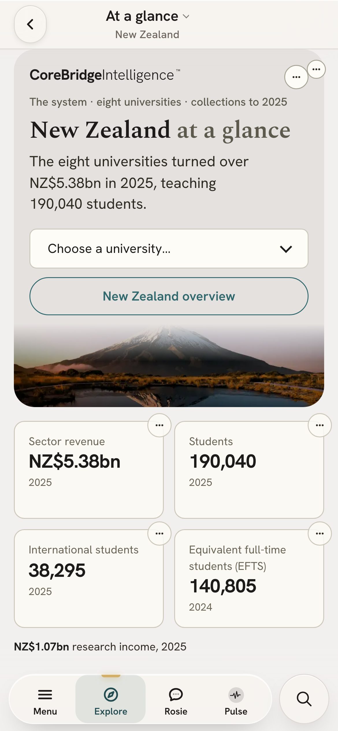
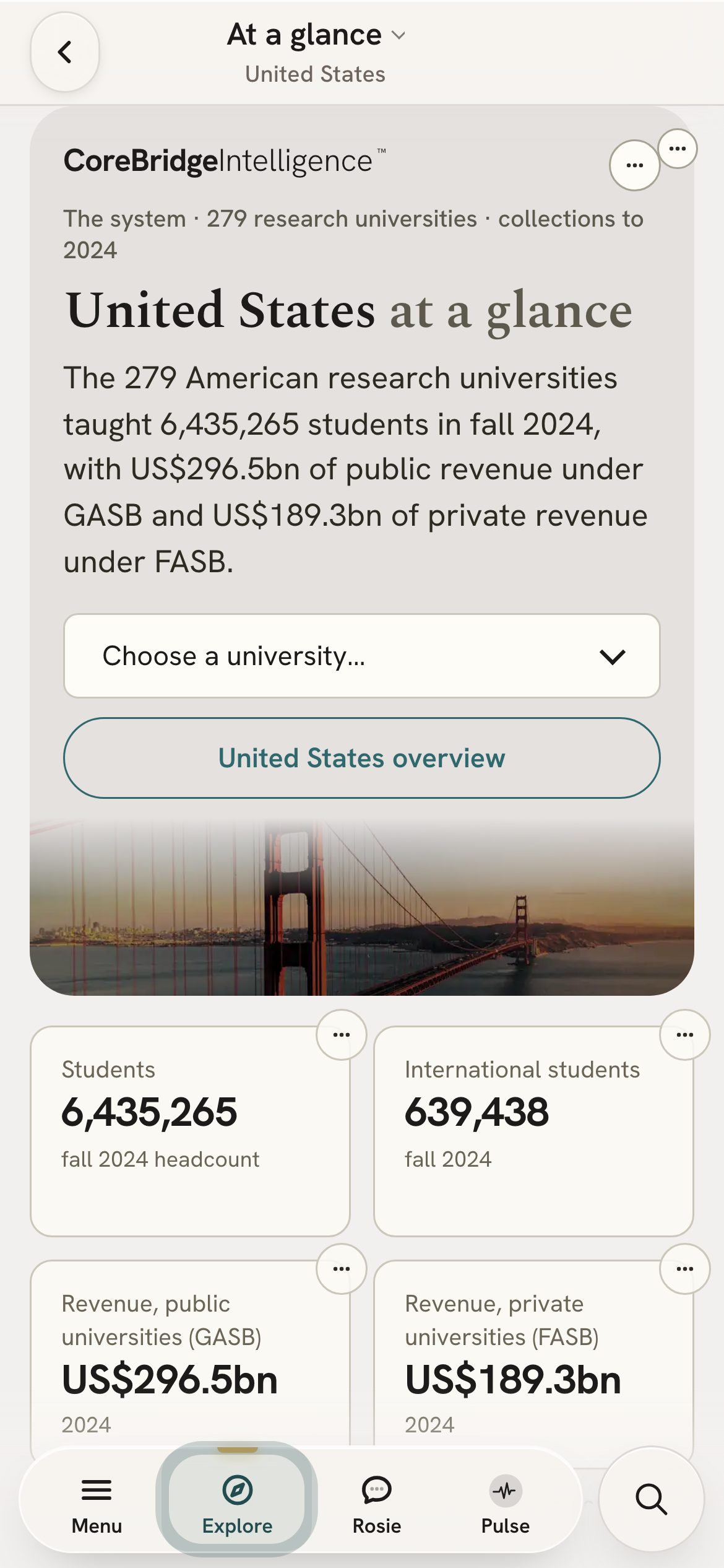
279 US institutions, with the medians for each research class.
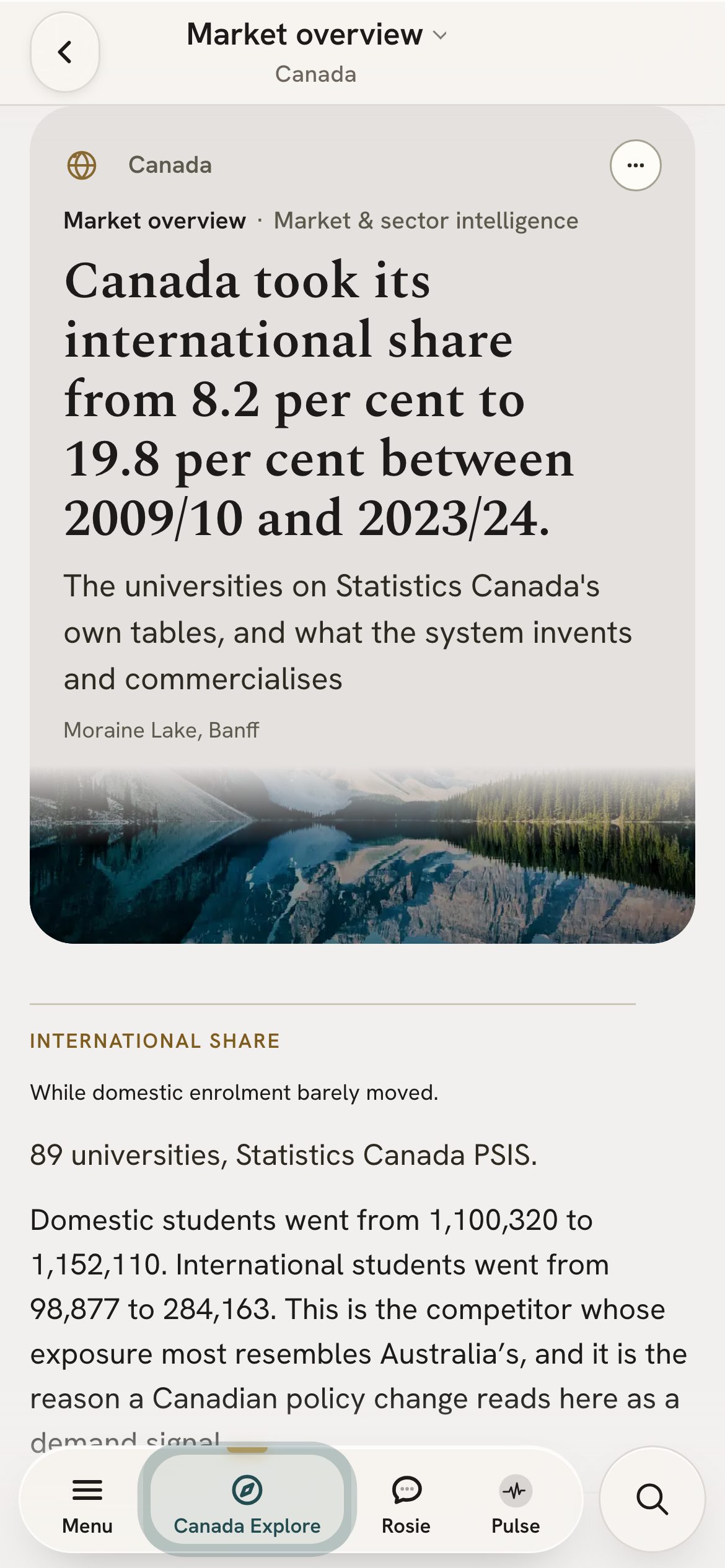
International share, research council awards and the finances of 89 Canadian institutions.
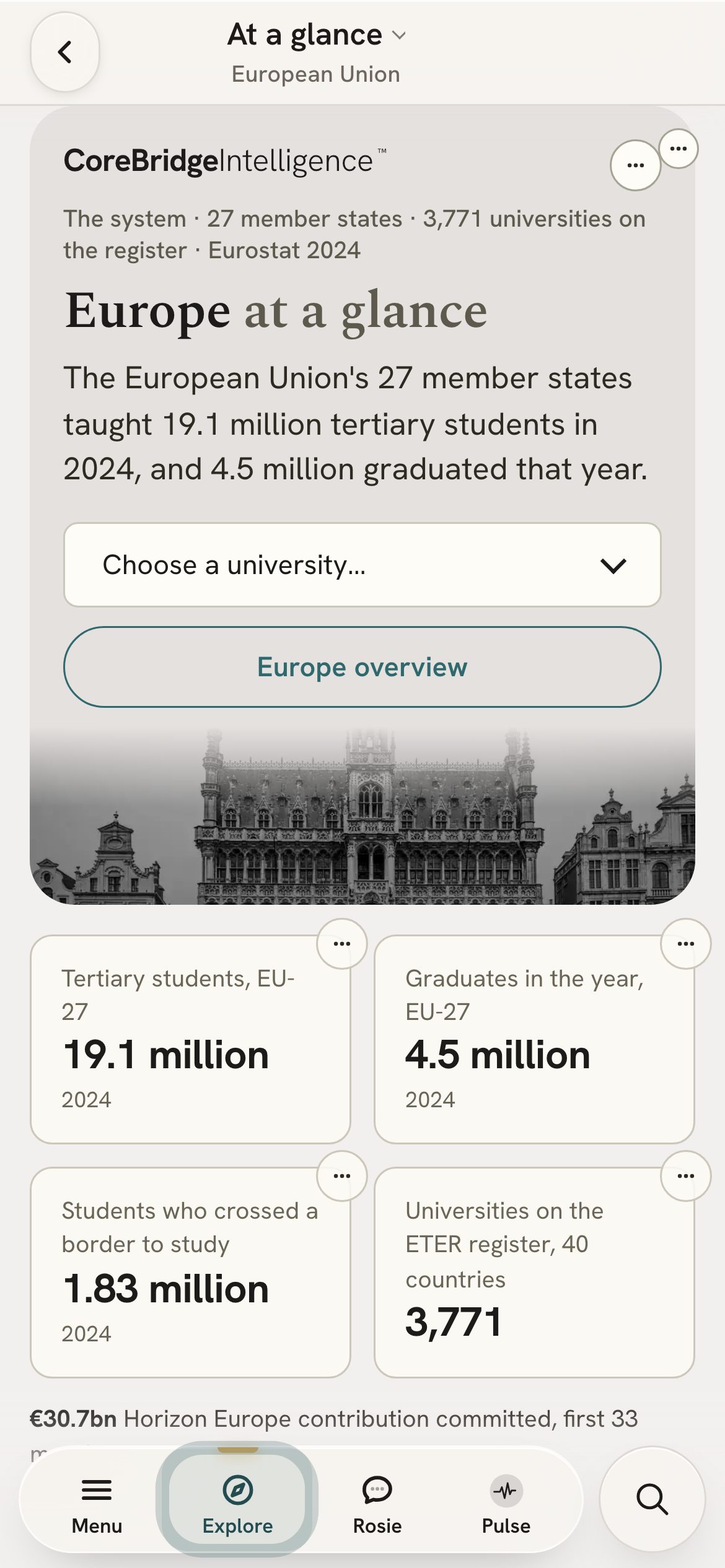
901 European and 201 Turkish institutions, with system ratios from the OECD.
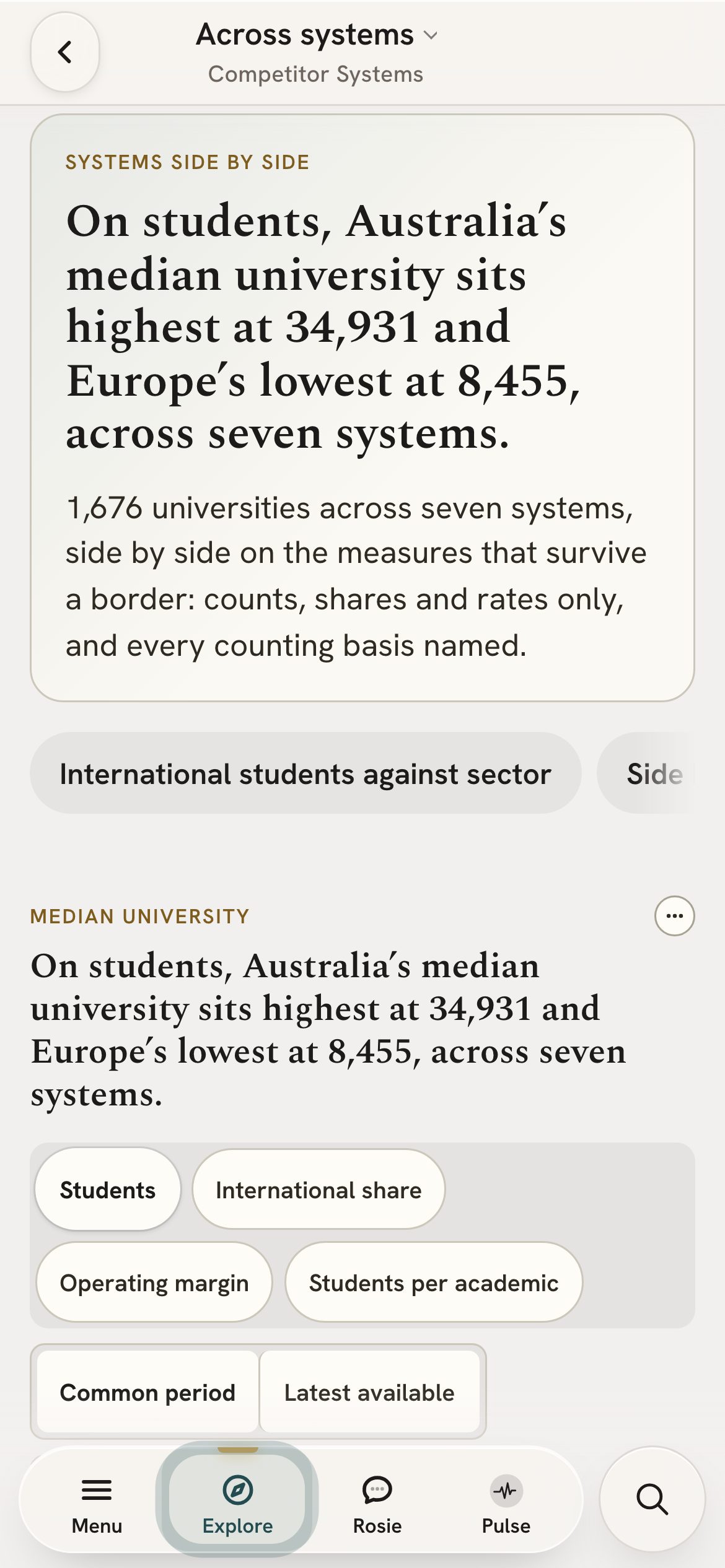
Set your university beside peers in Australia, the UK, New Zealand, the US, Canada and Europe.
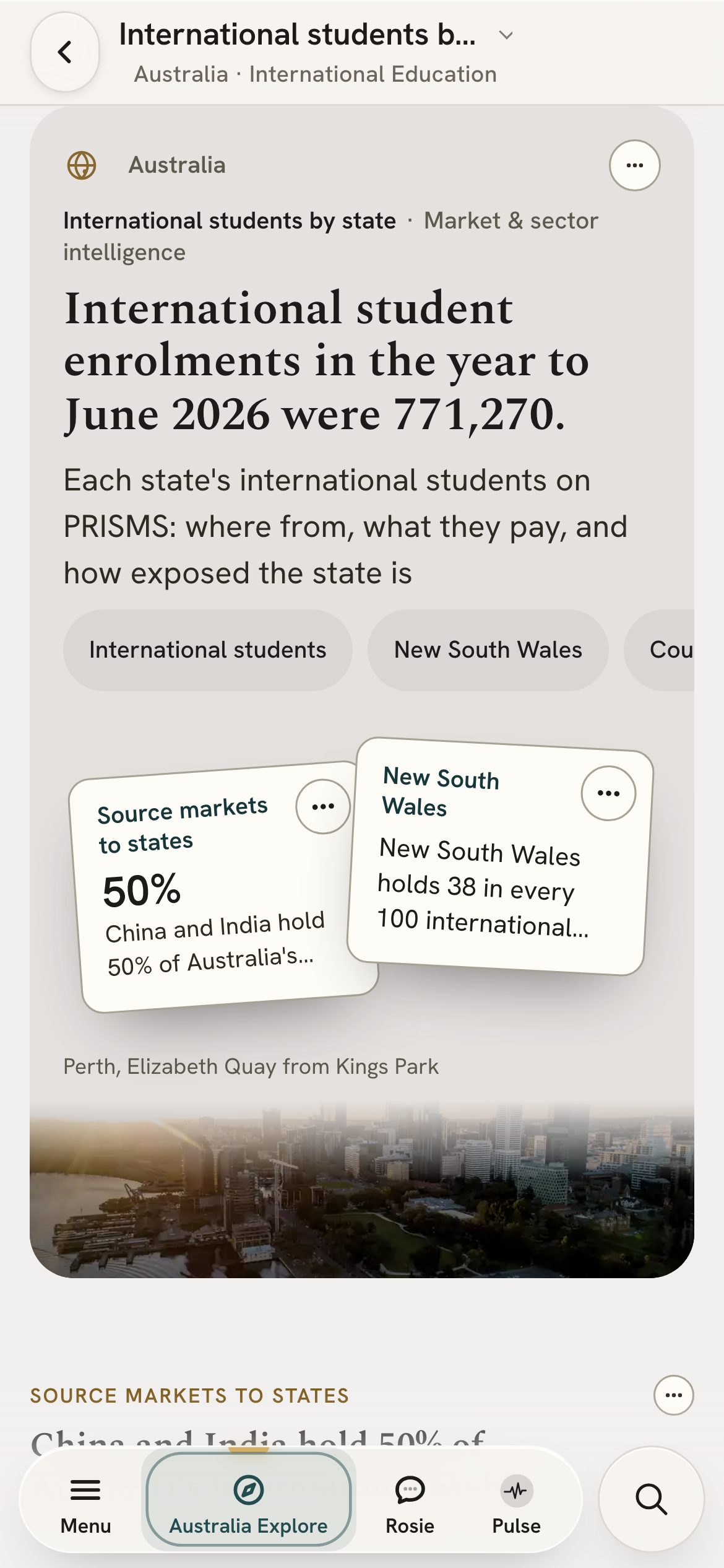
Every country that sends students to Australia, with its trend over time.
Student flows between countries, on one map you can search and open.
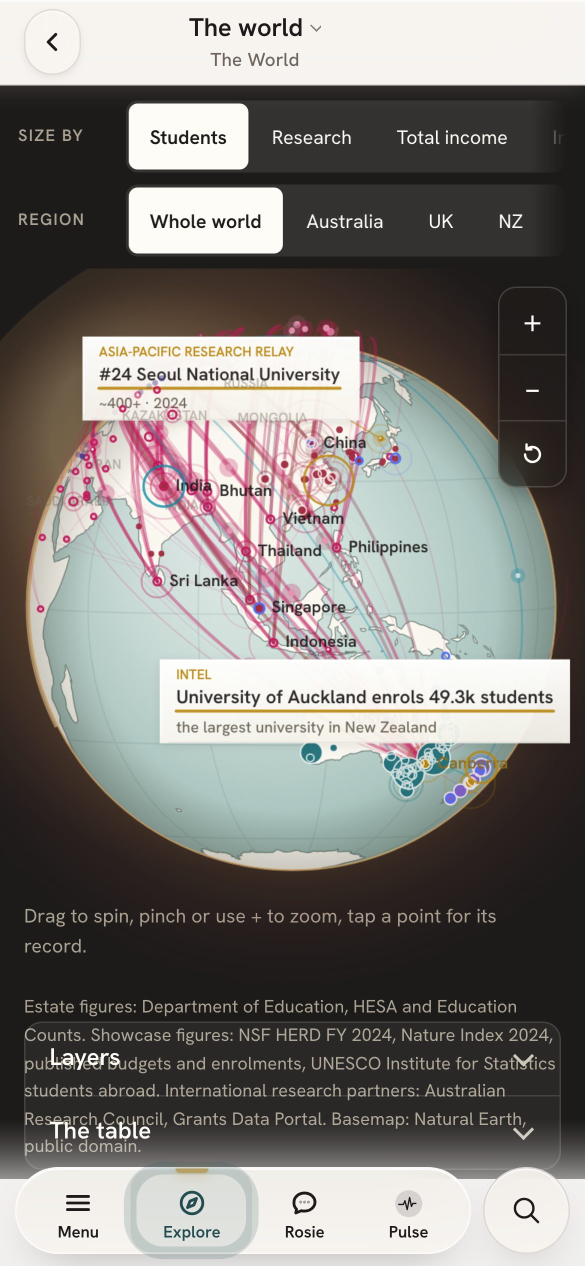
Government spending, costs and revenue, in cash and in real terms.
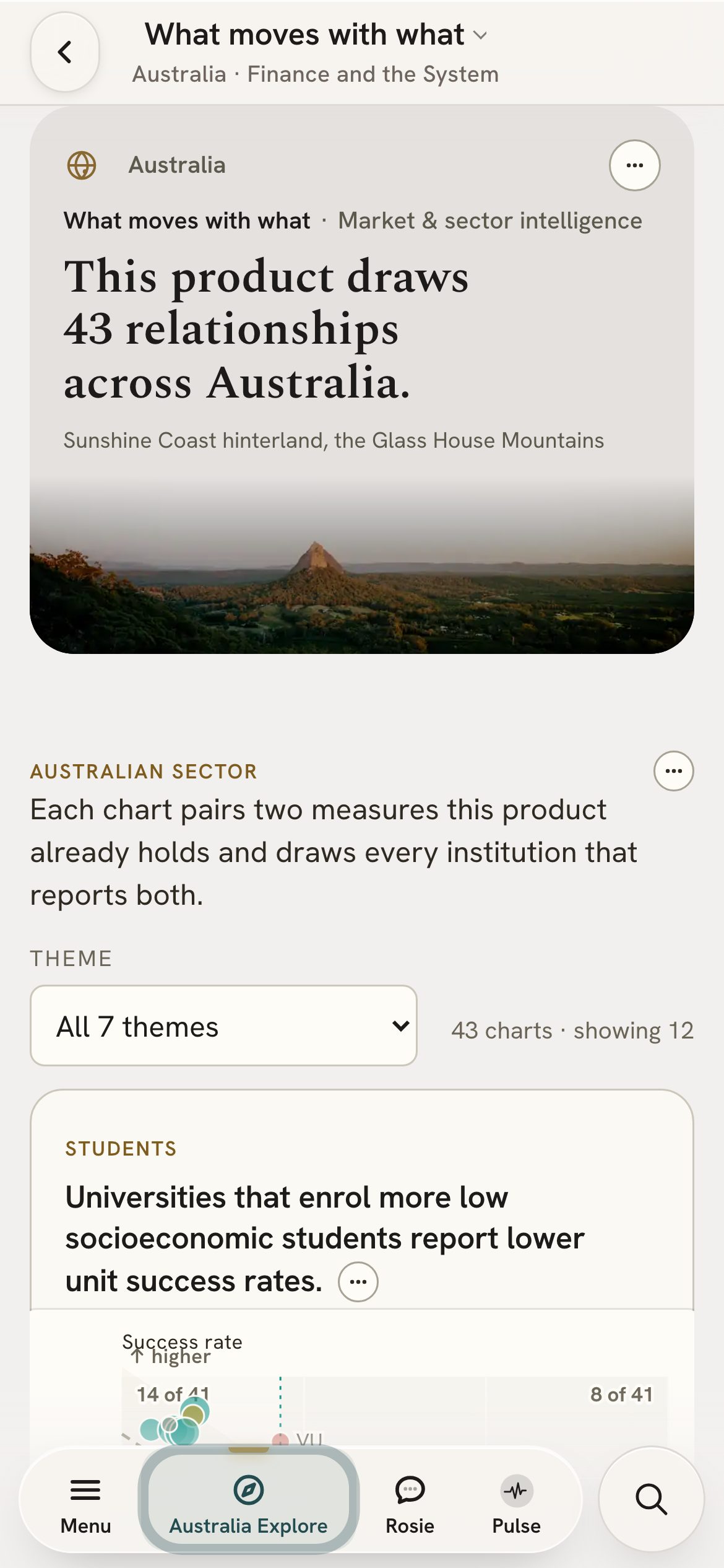
Degree attainment and adult learning, by state and by remoteness.
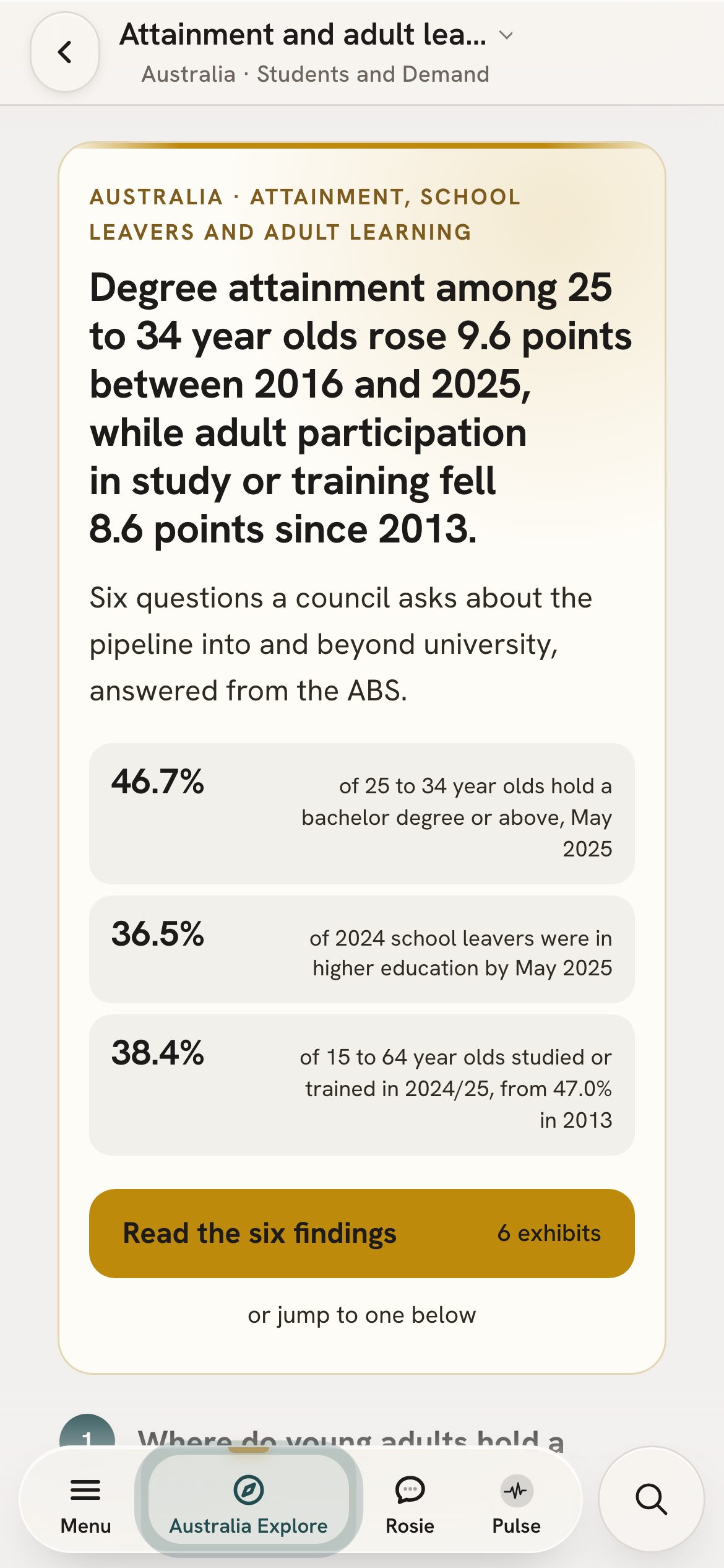
Donations against the sector and Go8 medians, with the division’s own measures.
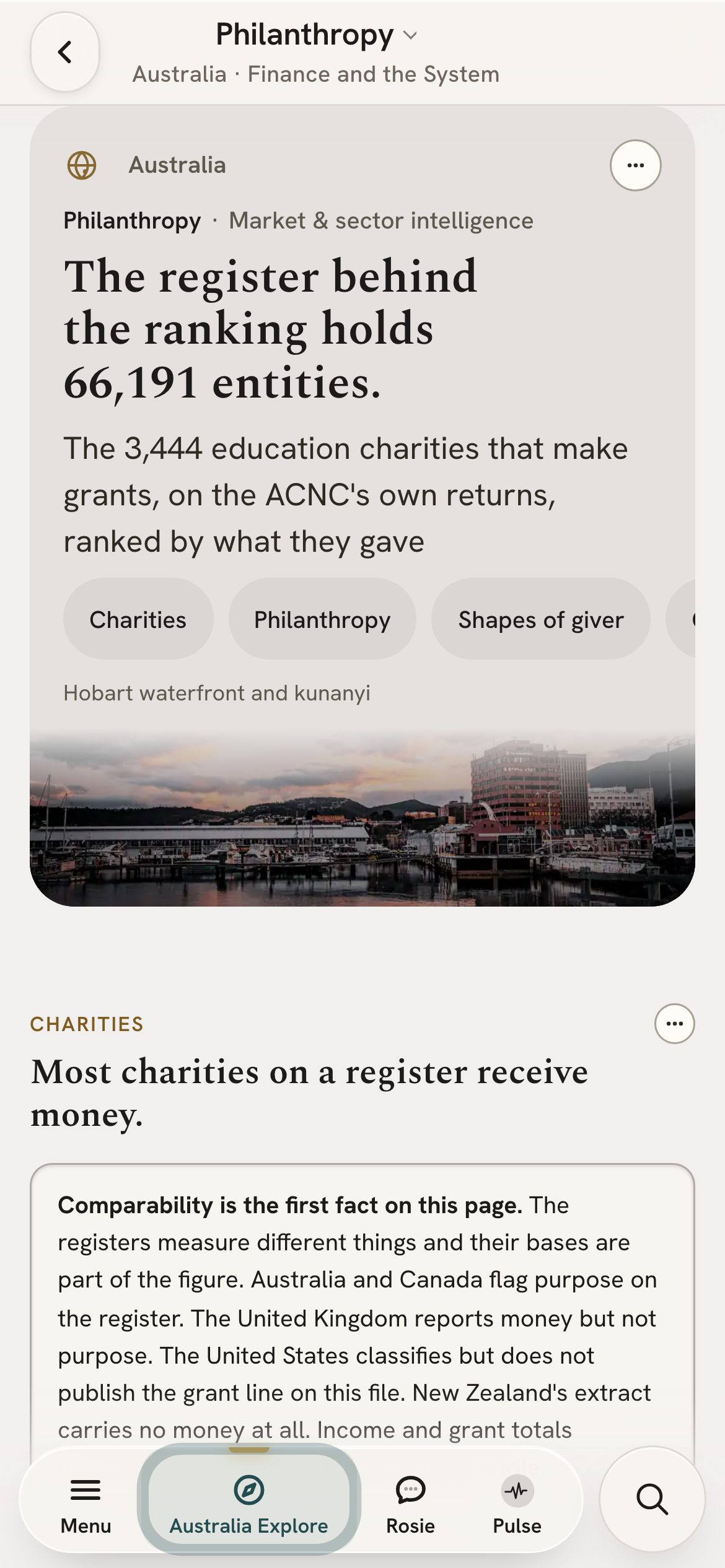
Where your university ranks, and how it has moved against its peers.
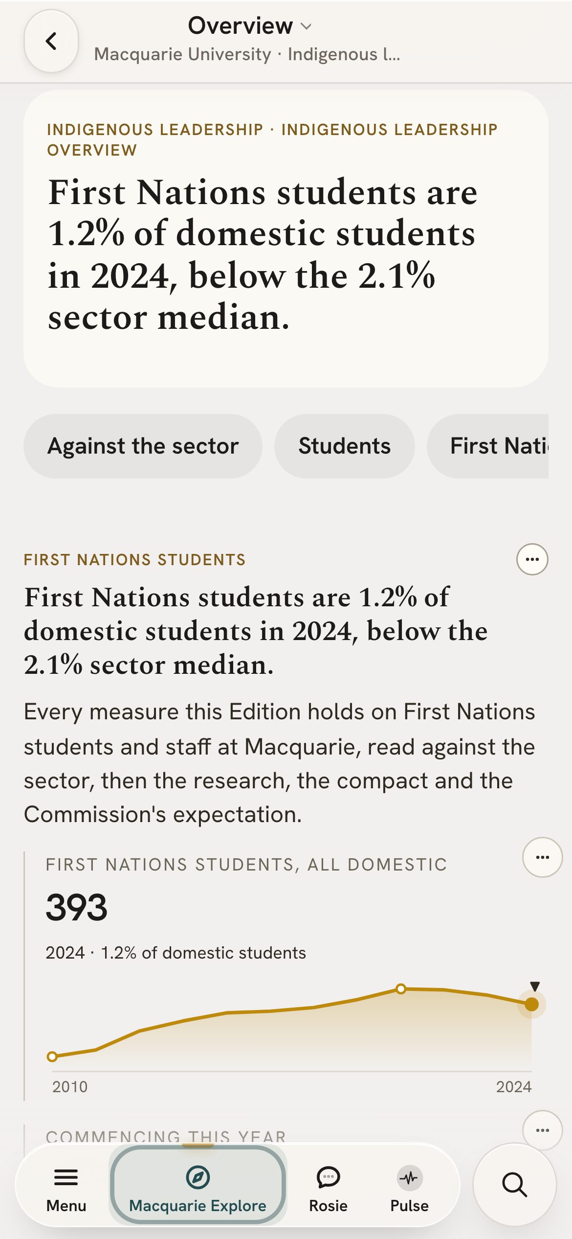
Students, staff and outcomes for First Nations people, against the sector.
Load, fee income and the domestic and international mix, over ten years.
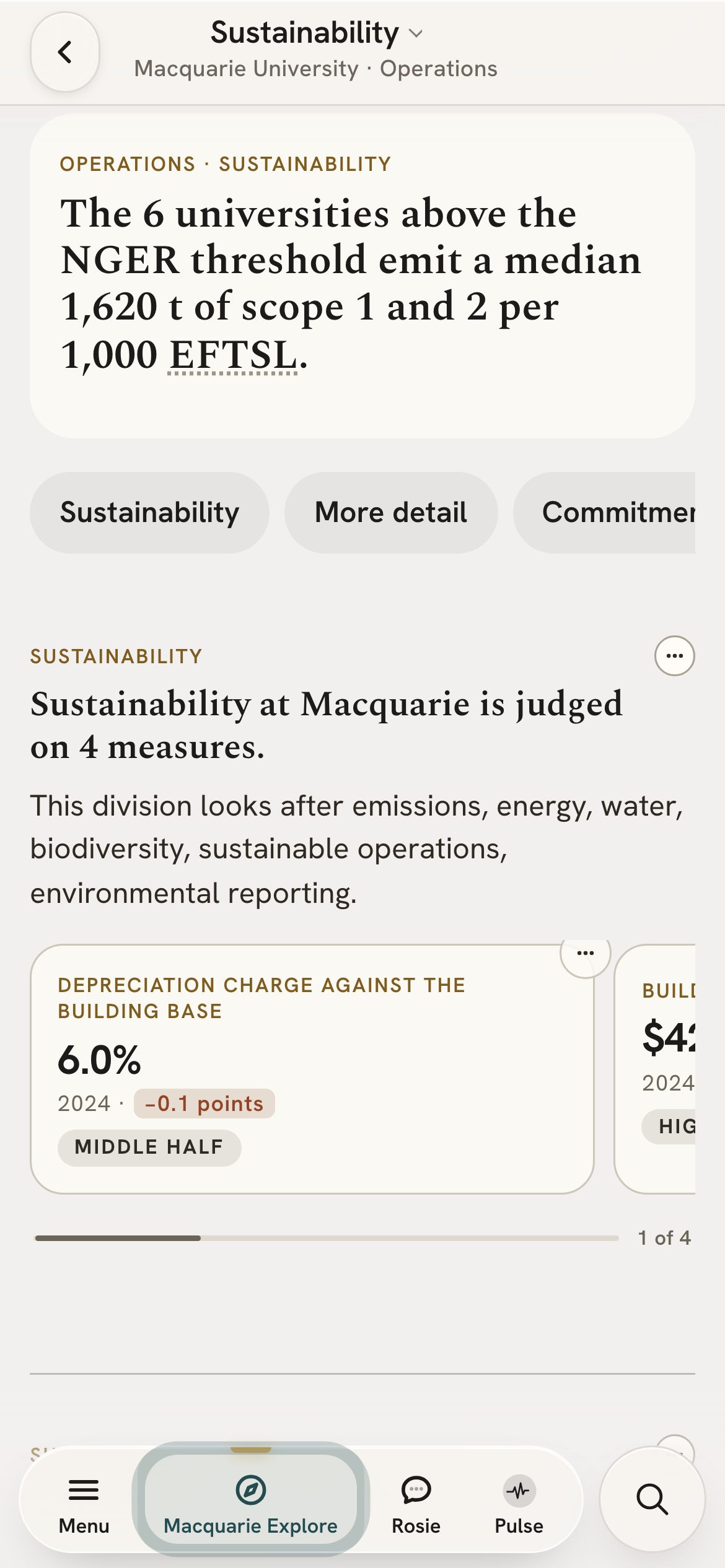
Scope 1 and 2 emissions per student, for universities above the NGER threshold.
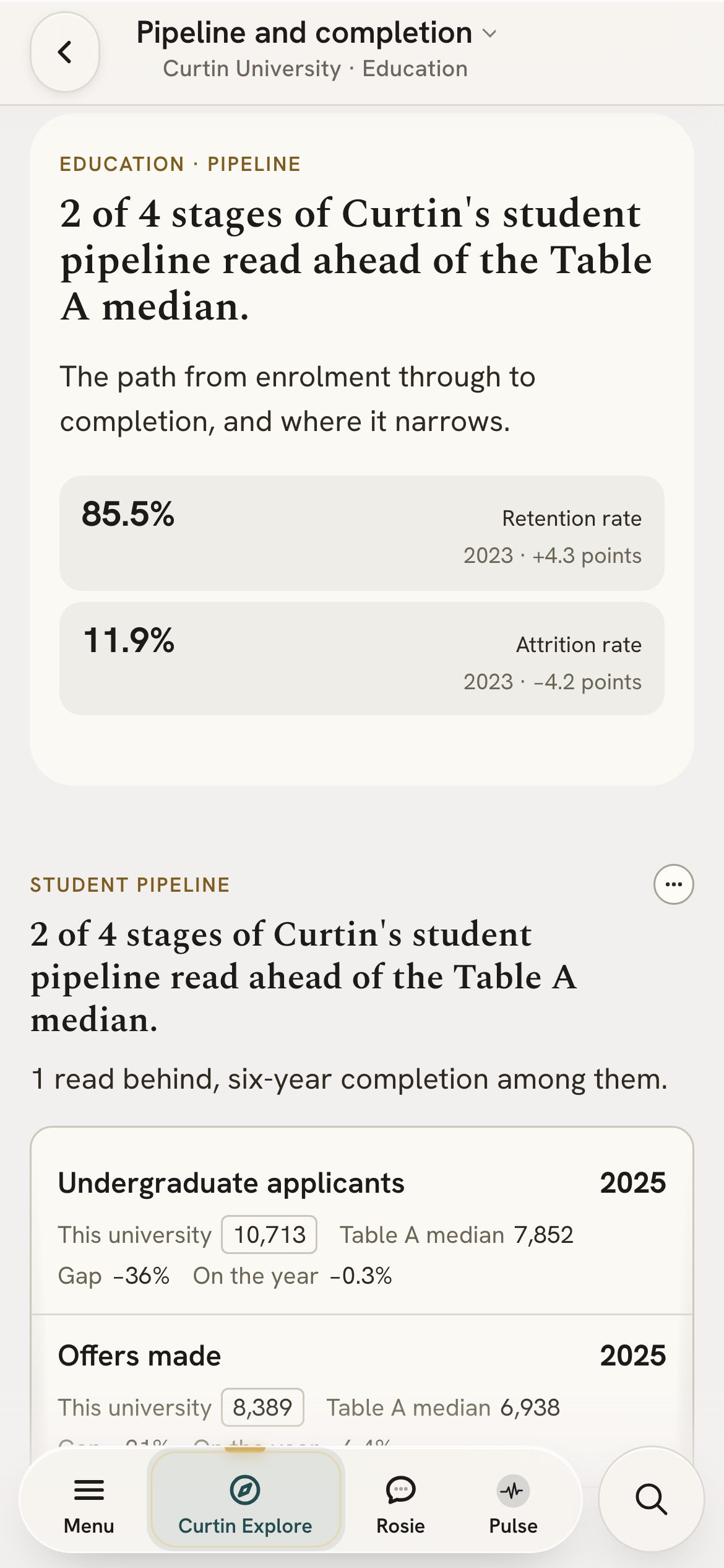
Workers’ compensation claims and workforce measures, against the sector.
Each number carries its publisher and its reporting year. Figures a publisher reported are kept apart from figures CoreBridge calculated and results a model produced, and each is labelled. Thresholds and bands are CoreBridge’s own settings, and say so.
National collections are not all defined the same way. Where definitions differ between systems, the page says so. Published figures can be revised after the Edition reads them.
Because it is all public data, the whole Edition is transparent. Every reader sees the same figures from the same sources, so your team can benchmark against publishers it already trusts.
Your seat stays secure. There is no password to steal. We hold only what a seat needs to work: your work email, your name and your sign-in record. None of your institution’s own data is ever held.
The Edition runs on Cloudflare, with a 100% uptime guarantee, unmetered DDoS protection, and PCI DSS and SOC 2 Type II compliance.
Free dashboards
Australia, the United Kingdom and New Zealand.
Free. No sign-in.
Executive Edition
More depth, other systems and the tools to prepare a briefing.
On application.
| Feature | Free dashboards | Executive Edition |
|---|---|---|
| Your university in depth | 10 views | 123 pages |
| Australian measures behind them | 172 | 1,115 |
| Other systems | Australia, the UK and New Zealand only | Peer comparisons with 1,470 institutions in the US, Canada, Europe and Türkiye |
| TAFEs, medical research institutes and CSIRO | Not included | 22 TAFEs, 44 institutes and CSIRO |
| The CHESS Ranking | Not included | Ten dimensions |
| The CFO model | Not included | A five-year financial scenario from your published accounts (beta) |
| Sector Scenario Lab | Not included | One assumption applied to every university’s published accounts (beta) |
| Rosie, your virtual Chief Business Strategist | Not included | Included (beta) |
| Board paper in Word, Market Intelligence deck in PowerPoint | Not included | Both included; the board paper is in beta |
| Access | Anyone, no sign-in | An institutional licence, agreed with CoreBridge Intelligence |
| Feature | Free dashboards | Executive Edition |
|---|---|---|
| Your university | ||
| Your university in depth | 10 views | 123 pages |
| Australian measures behind them | 172 | 1,115 |
| Every field you teach | Not included | 13 faculty pages |
| Campuses, courses and fees | Campus catchments only | 417 campuses, 11,325 courses, published fees |
| Governance, audit findings and controlled entities | Not included | Included |
| Where you stand | ||
| Your closest peers | Inside your own system | Across borders |
| The CHESS Ranking | Not included | Ten dimensions |
| Electorates, the policy register and the Intergenerational Report | Not included | Included |
| ATEC priorities and compacts | A summary (beta) | In full |
| The world | ||
| Australian and New Zealand universities | Included | Included |
| UK universities | 164 measures | 471 measures, with the UK’s own collections beside them |
| The US sector | Not included | 279 institutions |
| Canada | Not included | 89 institutions |
| Europe | Not included | 901 institutions |
| Türkiye | Not included | 201 institutions |
| Hong Kong, Singapore and South Africa | Not included | Market overviews, 25 universities |
| Middle East and North Africa | Not included | 1 institution |
| TAFEs, medical research institutes and CSIRO | Not included | 22 TAFEs, 44 institutes and CSIRO |
| International source markets | National trends | 81 market pages |
| Money, people and risk | ||
| The CFO model | Not included | A five-year financial scenario from your published accounts (beta) |
| Financial stress test | Not included | In beta |
| Sector Scenario Lab | Not included | One assumption applied to every university’s published accounts (beta) |
| Enterprise agreements and pay | Not included | 378 agreements, 47,031 pay rates (beta) |
| Philanthropy | Audited donations | Five national charity registers |
| Research and partners | ||
| Grant search | Funding totals only | 49,000+ grants, searchable |
| Named partners and research experts | Not included | 11,200 Research Council partners; 12,421 on the research map |
| Work done for you | ||
| Rosie, your virtual Chief Business Strategist | Not included | Included (beta) |
| A board paper that opens in Word | Not included | In beta |
| A Market Intelligence deck in PowerPoint | Not included | Included |
| The licence | ||
| Access | Anyone, no sign-in | An institutional licence, agreed with CoreBridge Intelligence |
| Price | Free | On application |
Counts are for an Australian university, as the product holds them today. (beta) marks a tool still in beta.
The Edition already holds peers in the United Kingdom, New Zealand, the United States, Canada, Europe and Türkiye, market overviews for Hong Kong, Singapore and South Africa, and the international student source markets. A full country edition reads each of that country’s institutions at the depth Australia has today. Australia is open now; the United Kingdom follows at the end of 2026; Canada, New Zealand and the United States in 2027.
Depth, breadth and tools. The Edition reads every Australian university in far greater depth than the free dashboards, and adds peers in other systems, TAFEs and medical research institutes, the CHESS Ranking, scenario modelling, Rosie, and papers and briefings you can edit. The table above lists each difference, and the sample outputs on this page show what the tools produce.
Every Australian university in depth, 22 TAFEs, 44 medical research institutes and CSIRO, peers in the United Kingdom, New Zealand, the United States, Canada, Europe and Türkiye, market overviews for Hong Kong, Singapore and South Africa, and one institution in the Middle East and North Africa. Each chart states the years it covers.
Each has its own section above, with what the Edition holds for it now. TAFE coverage is narrower than university coverage.
Each chart names its source and reporting year. Most collections are published once a year, so the latest figure is the publisher’s latest release.
You and your peers are set side by side on the same published measure and year. Where two systems define a measure differently, the page says so.
A scenario applies assumptions you set to published accounts. It illustrates those assumptions. It is not a forecast, and not a statement of CoreBridge’s preferred policy.
Yes. The board paper (beta) opens in Word and the Market Intelligence deck in PowerPoint. Each file carries a disclaimer and is a draft for your team to review.
Named users across your executive and governing body, agreed with CoreBridge Intelligence when the licence is set up. Access follows the seat, so it can pass to a successor. Onboarding and support are part of the licence discussion. The price is on application.
Yes. Every Australian university is read at the same depth, on the same published measures. TAFEs, medical research institutes and peers abroad are read at the depth their own collections allow, and the Coverage page shows what each holds.
The United Kingdom (157 universities) and New Zealand (eight) in full, as free dashboards and inside the Edition. Peers in the United States (279 R1 and R2 universities), Canada (89) and Europe (1,102 universities in 37 countries, Türkiye’s 201 among them), with market overviews for Hong Kong, Singapore and South Africa, and New York University Abu Dhabi for the Middle East and North Africa. Eighty-one international student source markets. OECD and World Bank measures by country. Full editions for the United Kingdom, Canada, New Zealand and the United States follow the dates on this page.
Each system publishes on its own definitions and reporting years. Within a system the Edition compares on the same measure and year. Across systems it sets side by side only the measures the collections define closely enough to read in one row, and the page names what still differs.
Yes, on the device you used. The financial model and the CFO model save runs in your browser, the CFO model up to thirty, and can compare saved runs. The Sector Scenario Lab keeps your settings. Each gives a link that reopens the same run for a colleague. Saved runs are not held on CoreBridge’s servers.
Each figure carries its publisher and reporting year on the page, and every exported paper, deck and table carries the same references with a disclaimer. Reported figures are kept apart from figures CoreBridge calculated and results a model produced.
Board and executive papers open in Word. The Market Intelligence deck and the stress-test deck open in PowerPoint. Most charts copy as CSV and save as a dated PNG. The University report prints to PDF.
The board paper, the CFO model, the financial stress test, the Sector Scenario Lab, Rosie, and enterprise agreements and pay rates. Each carries a beta mark on its page.
Each figure is shown as the publisher had it when the Edition last read that collection, with the reporting year beside it. Publishers revise, so a later release can change a figure. When the Edition incorporates the new release the page shows the new figure and names the release. A separate log of revised figures is not yet published.
Your work email, name and role, your organisation, when you sign in and which pages you open. Scenarios you save stay in your own browser. The Edition holds no organisation’s internal or confidential information.
No. The Edition works from published sources only and holds no organisation’s internal or confidential information.
Reach out to Chris Roberts, Strategic Partnerships, CoreBridge Intelligence, at [email protected], and request a demonstration built around a question from your next meeting.
Request a demonstration
Request a demonstration shaped around your institution, portfolio or policy question. We will show you the relevant evidence, explain the coverage and explore how your team could use it.

